Periodic Table of Office Design
Knowledge / Blog

/ The Periodic Table of Office Design

The Periodic Table of Office Design

We had a lot of fun working on the Periodic Table of Office Design which we hope you find not only useful but also inspiring.

The Periodic Table of Office Design has been in the pipeline for some time and certainly helped foster a healthy debate among our design team in relation to what elements should be included (and what shouldn’t), so we completely appreciate that some of you might also feel that we’ve left something out or vice versa – we accept that we are fallible and welcome any feedback. We’ve also read lots of other content while researching and have to mention a recently published book – The Elemental Workplace from Neil Usher, which was truly inspirational – check it out.

Here at K2 Space, we firmly believe that ‘great staff deserve a great workplace’ and have taken a staff-centric view of office design, and hope this is reflected in the Periodic Table of Office Design and the elements that we have included.
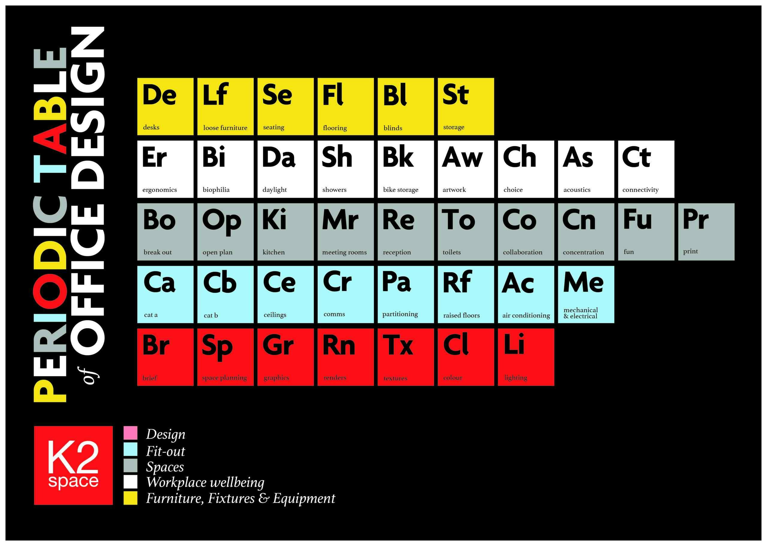
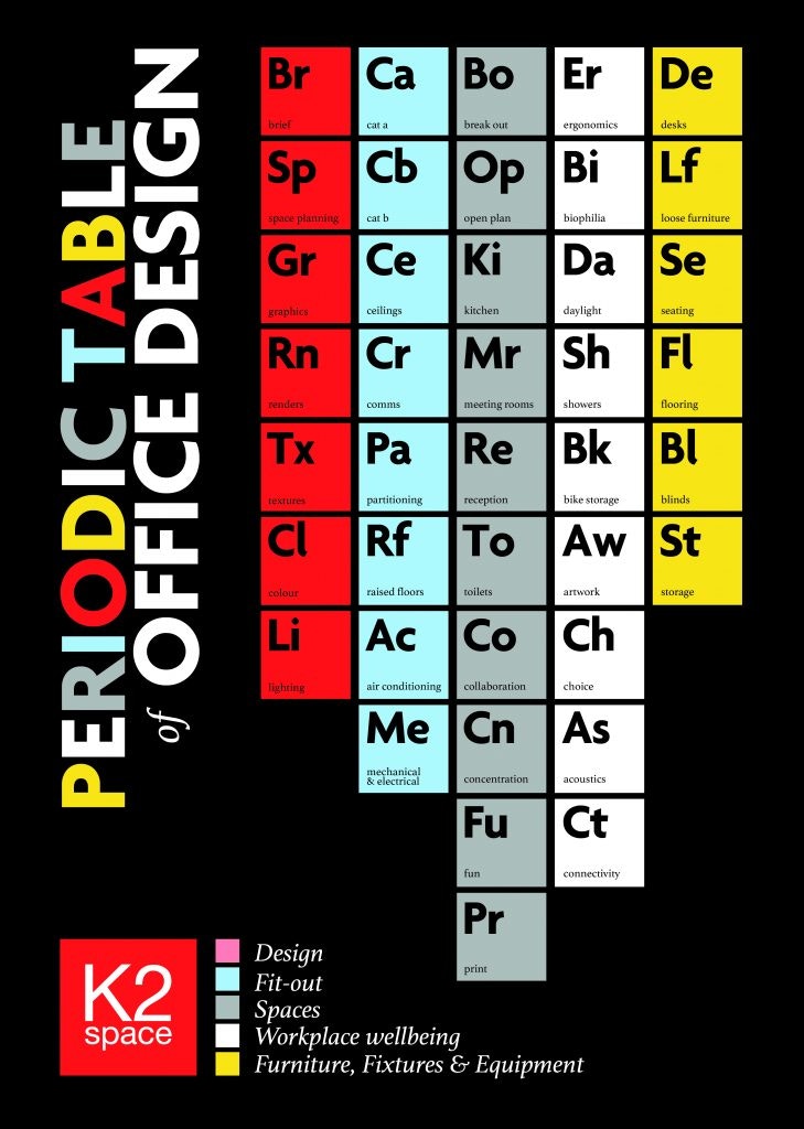
Download the infographic in printable format

The Periodic Table of Office Design

Below, we have included a short overview of each element with links to more in-depth content provided more information on that specific element – an office design glossary of sorts. If you find the Periodic Table of Office Design useful, you can download the infographic in printable format.

DESIGN

Brief – Defining the brief before working on any office design concepts or space plans is critically important as our designers need to fully understand your specific requirements and what you want any new space to deliver for you and your staff. Defining your brief can be a fun and collaborative process and we recommend getting a wide range of views from key stakeholders and staff through a range of workshops, questionnaires and interviews.

Space Planning – Once the brief has been properly defined and our office designers have spent time getting to know the space, they can begin work on creating a layout and 2D space plans to illustrate the space that will be configured. We work closely with clients at this stage to get the layout right and discuss team adjacencies, hot desking, location of meeting rooms and collaborative space and also routes/paths to key areas like the breakout space, toilets and printers.

Graphics – Graphics can be used to convey your branding and brand values via visuals carefully positioned within the workplace. They can also be utilised to denote what certain spaces are designed for i.e. collaboration, concentration, fun etc…

Renders – Also, known as CGI’s (Computer Generated Images), renders are used to convey how the space will look and how the design concept translates into reality. They are designed to be as realistic as possible, giving the client a true insight into what is possible within the space and are used during the pitch stage and also once the brief, design concept and space plans have been approved.

Textures – The modern workplace is a mix of textures and finishes including carpet, wooden floors, polished concrete, ceramic tiling, metalwork, plant life and glazing to name just some. On any project, we consider a wide range of textures and finishes and work closely with clients to select combinations that work and that reflect their brief.

Colour – The colour palette used as part of the office design can have a major impact and, in this article, we look at the psychology of colour in workplace. In addition, we will always consider a client’s brand palette and how it can be incorporated that into the workplace design.

Lighting – Lighting is so, so important but is often an afterthought. Getting lighting levels right across the workplace, taking into consideration what different areas and spaces are designed for is critical. It’s also worth considering efficient and sustainable lighting options which have grown in popularity and importance over recent years.

FIT OUT

Cat A – You’ll hear a lot of designers and fit out professionals reference Cat A during a design and build project. A Cat A design and fit out generally focuses on the mechanical and electrical elements of the space including air conditioning, heating, ventilation, electrical/power outlets, and also in many cases, raised floors and ceilings. What a Cat A fit out delivers is a habitable space, a blank canvas of sorts, that companies can visit with a view to taking on a lease. Following this, the space would then be designed to match their specific requirements.

Cat B – Again, you’ll definitely hear mentions of Cat B design and fit out during any workplace design project, and simply put, a Cat B design and fit out elevates and transforms a space from its Cat A state to a fully designed office where staff can work. Cat B design focuses on the finishes, the layout/areas of the office (open plan, meeting rooms, reception, breakout etc…) and importantly the furniture.

Ceilings – Ceiling are an often overlooked, almost ‘invisible’ workplace element and up to a few years ago, the norm was for companies and designers to install a ceiling grid structure and tiles which hid ductwork and mechanical services. However, over recent years, exposed ceilings have been very much ‘on trend’ with exposed services, ductwork and electrical components complimenting a desire to convey a raw, urbane look and feel.

Comms – Many offices require a dedicated comms room where IT equipment such as server stacks that provide the space with connectivity are housed. The space requires special consideration and treatment with regard to air conditioning, ventilation and heating with a constant, consistent temperature required at all times.

Partitioning – Partitioning allows clients to divide the office into different areas and spaces such as meeting rooms, private offices, reception and breakout spaces. When it comes to partitioning, there are now numerous options from traditional stud partitioning to glazed partitions to newer, metal grid-like wonderwall structures that divide spaces.

Raised Floors – Raised floors are generally used within open-plan workspaces and allow for effective, cable management hidden underneath the floor and routed to desk positions. There are numerous systems and providers but generally raised floors sit on metal stilts applied to the base floor with power boxes cut out in the designated positions. Carpet or vinyl flooring is then usually applied to the raised floor system.

Air Conditioning – Aircon is absolutely vital to the workplace and ensuring that air quality is optimised and that the temperature is easily controlled during hot and cold weather is imperative. A modern air conditioning/handling unit servicing the space via grills and ducts is important to consider and can play a major role when it comes to staff wellbeing.

Mechanical and Electrical – The mechanical and electrical or M&E as it is more frequently referred to, element of any design and fit out project pertains to the various mechanical and electrical services that your new space requires – from heating and air conditioning to ventilation and power supply/distribution and much more. It’s a term that covers a large share of any office fit out and can also be the most expensive element once combined of any project.

SPACES

Break Out – The break out space is designed to be somewhere within the workspace where staff can relax, have a coffee and/or take their lunch. Nowadays. the spaces tend to be comfortable with many amenities and can also double as informal work areas away from the desk where staff can work or catch up with colleagues.

Open Plan – This may not require a lot of explanation but the open plan is the workspace mainly populated with rows of desking and chairs and is where staff tend to spend much of their time.

Kitchen – Again, does not require much explanation but can vary from office to office as some will have large, kitchen spaces while others may just have a simple tea-point and fridge. The kitchen and the breakout space have merged in many cases into just one large dynamic space but unfortunately, we think, some workplaces still have tiny, basic kitchenettes with a kettle, small fridge and nowhere to sit.

Meeting Rooms – No introduction is required here but meeting rooms do form a major part of the office landscape and are important considerations. Most offices will contain a large meeting room or boardroom designed for formal meetings and client discussions and also a selection of smaller meeting spaces. It’s important to consider how many meeting rooms you’ll actually need as they do take up a lot of space.

Reception – The reception area has the ability to leave a lasting first impression on visitors and so is usually the main concern for clients who want the space to reflect their corporate identity. Essentially the reception forms a vital part of the workplace experience and typically we spend a lot of time discussing ideas and design concepts for the reception area with clients.

Toilets – Of course toilets and washrooms are integral elements of any office design and while not a great deal of time has traditionally been spent on designing toilet areas, this has begun to change over recent years. Many offices used to have dedicated visitor toilets – ‘the fancy loos’, but increasingly it has become a fundamental must-have for all workplaces to have attractive (and obviously, functional) toilets.

Collaboration – The big ‘C’ was a major buzzword back in the day and caused many eyes to roll when used excessively, but nonetheless is still a vital consideration when designing any workplace. Design can be used to encourage collaboration by including dedicated spaces that facilitate it – small meeting hubs, soft seating areas, tall standing tables, attractive breakout space(s) and of course meeting rooms.

Concentration – As collaboration became the buzzword, concentration struggled to receive the attention it deserved but that has now changed. Design must provide spaces where staff can concentrate, away from their desk, the open plan and/or any space(s) where distraction is possible. Many offices now contain dedicated pods or small rooms for concentration where individuals can lock themselves away to avoid distraction.

Fun – A controversial one perhaps but the design should be a fun process and we always encourage clients to incorporate elements of fun into the workplace design, be that through a dedicated games area with pool, darts or table football; incorporating artwork, murals or graphics or simply by embracing colour or subtle residential influences. It’s also worth noting that fun is relative to each company and can take different forms depending on that company’s values and work culture.

Print – While we await the paperless office, the vast majority of offices still require a dedicated print area and as such they constitute an element. These spaces can vary from space to space, from large print rooms in law firms to smaller spaces positioned in corners adjacent to the open plan.

WORKPLACE WELLBEING

Ergonomics – The ergonomic workplace is a given at this stage but it is important that it is considered during the design phase, especially where a variety of spaces that staff can choose to work from. Ensuring all of these spaces are as comfortable and ergonomically sound as possible is key, whether they be beanbag lounges, treehouses or simply seating options.

Biophilia – Biophilia refers to the fact that as human beings, we have an instinctive bond with nature and our natural outdoor surroundings. In turn, Biophilic Design takes this bond and works to apply it to spaces where we live, shop, relax and work and in the case of the workplace can mean a variety of natural finishes being utilised, the presence of plants/greenery, maximising natural light etc… and has proven to have a positive impact – you can read more about Biophilic Office Design in our dedicated article.

Daylight – the focus on workplace wellbeing has led to daylight becoming a key element of office design, with studies finding that maximising access to natural daylight can have a profound impact on everything from wellbeing to productivity and creativity.

Showers – as more and more workers prefer to run or cycle to work or during lunch breaks, showers have become an increasingly important element of office design. Modern, progressive offices now have high-class showering and changing facilities as standard in an attempt to ensure they attract and retain the very best talent.

Bike storage – As previously stated, more and more workers are using two wheels to commute to and from work and as such the provision of adequate bike storage has become a key consideration for many companies and subsequently office designers.

Artwork – Numerous studies have shown that the presence of artwork in a work environment can inspire creativity and boost productivity, while also acting as a feature. We always recommend that companies consider artwork or some form of visual stimuli within the workplace, and you can read about the impact of art on office design in our dedicated article.

Choice – The workplace has evolved from a rudimentary layout containing rows of desks, some private offices, meeting rooms and a storage closet, to become a space where staff can choose from work from a variety of alternative work settings. Empowering staff to work as they choose, depending on the task at hand is not ground-breaking news but it providing this choice has been embedded into the office design psyche.

Acoustics – Nobody likes a loud office where you can’t hear yourself think or spaces without any real privacy. Acoustics are a major consideration and a key element of office design success, so ensuring that acoustic products are utilised where required and that there is a choice of spaces available for staff to take calls, host meetings, concentrate etc… is paramount. Noise is unavoidable but providing spaces to accommodate it and also get away from it, can provide the answer.

Connectivity – An office with poor connectivity is quite frankly not an office. There is literally no way in today’s world that staff should have to suffer through poor connectivity and as such ensuring that any new workplace provides staff with lightning-fast internet speeds is simply a must.

FURNITURE, FIXTURES & EQUIPMENT (FF&E)

Desks – Some would argue that the desk is dead and while the modern workplace has progressed beyond the desk, we still feel that the desk (including hot desks and touchdown spaces) is hugely important and is somewhere where staff carry out a majority of their tasks. As such, comfortable desk solutions that take size into consideration along with the type of devices used are a key design element, and that’s before we even mention the rise of the sit-stand desk.

Loose furniture – While desks and seats can constitute the majority of furniture used within a workplace, the term loose furniture is used in reference to other pieces of furniture including the soft seating used in the breakout areas, benches and stools in the kitchen, guest seating at reception and/or the meeting room tables. Loose furniture can define a space and in our view is extremely important to carefully select pieces that complement the design.

Seating – Various forms of seating are utilised within the workplace, from task chairs where staff sit to guest seating at reception to meeting rooms seats to tall kitchen stools, and all are important elements. Again, the selection is critical and spending time understanding what works best and where is so important.

Flooring – A major element of any workplace and can take the form of carpet, wood, vinyl or even ceramic tiles. There is now an incredible variance in the flooring options available to office designers and clients alike, with many spaces now embracing a mix of textures and styles. The emergence of luxury vinyl finishes has further increased choice and have proven incredibly popular.

Blinds – While we wholeheartedly recommend embracing natural light, if you have a lot of windows, you may well require blinds that can be used when necessary. There is a raft of options available from blackout blinds for meeting rooms to anti-glare options, so it is worth considering what works best for the space.

Storage – Storage forms a huge part of any design project and in many cases, one of our first tangible tasks is to perform a storage audit to ascertain storage needs for a client moving office or refurbishing an existing space. From staff pedestals to storage walls and lockable staff lockers, there is an abundance of options available nowadays with staff lockers proving popular and also acting as features in many spaces.

FINAL THOUGHTS ON THE PERIODIC TABLE OF OFFICE DESIGN

How we work has evolved alongside technology and so too has office design with the modern workplace offering staff flexibility and a more agile way of working. However, we firmly believe that getting the fundamentals right is key, and by this, we mean having access to natural light, ergonomic furniture, getting lighting and acoustics right and ensuring air conditioning works as it should. Putting the right foundations in place and then building on that is critical to designing a space that truly works, and we hope that our interpretation of the Periodic Table of Office Design reflects this. To learn more about office fit out and design terminology check out of FAQ section.

Latest Articles