Share
Summarise

Colourful, vibrant workplaces have increasingly become the norm as companies and office designers tune into the importance of colours used in the workplace and the impact that different colours can have.
In this piece, we’ll take a look at the colour of office design, the psychology of colour in the workplace, what colours are perceived to be best used and where and what designers should consider when selecting colours.
The colour palette and tones selected for any work environment have the potential to have a major impact on everything from employee productivity, workplace wellbeing and importantly, their general mood. In fact, the great Picasso is quoted as stating that ‘Colours, like features, follow the changes of the emotions’.
Our office design team are a colourful bunch themselves and work closely with clients when defining the design brief for a new workplace, and part of this entails carefully considering the colours and tones to be used throughout the space. The starting point is generally the brand palette and discussing how much they want their new space to utilise this palette, where it should be used and why. The brand has a huge role to play as brand colours have the powerful ability to connect people, including staff to a brand and the associated brand values – think about some of the biggest brands out there and you can more than likely associate a colour (or colours) with them.
Many companies now strive to create workplaces that not only reflect their brand but truly embody that brand and its values. In essence, the workplace becomes a strategic branding tool and while there is a lot more to it than just positioning logos and selecting brand colours, colour does have a major role to play.
For example, one of the key areas to consider is the reception space where guests arrive and what messages you wish to convey to visitors and staff alike. This area has the ability to leave a lasting impression and the colours used need to ensure that the brand is instantly recognisable and that it emits a positive emotional response.
Now, before concentrating solely on the reception area, gaining a full understanding of the effect different colours have is a good place to begin when it comes to designing any new workplace. To provide some context, it’s worth referencing a recent University of Texas study which found that overly grey, beige and/or white offices led to staff showing increased feelings of sadness and depression, especially in women, while men encountered similar emotions when placed in overly purple and orange work environments.
However, it is important to point out that there are a large number of variables such as individuals reacting differently to different visual stimuli, the variance in tones of the same colour and importantly, how different colours are used together in combination. Consequently, the simple, perceived rule of thumb that for example, yellow is the good energising stuff, orange can inspire creativity and blue exudes calm cannot be wholly adhered to and requires far more thought. I know, there is a lot of conflicting theory and it can appear confusing, so where do you start and what do office designers need to keep in mind when selecting colours to use?
Office design professionals are acutely aware that certain colours can positively contribute to happiness, productivity, and even physical health in a workplace. However, that doesn’t mean that they can simply apply a coat of paint and hey presto, magically these objectives are reached. Office design teams need to look at and understand the combination and relationship between other elements like lighting, textures, furniture and also the company culture. The key is finding the right balance and creating a space that is comfortable and where staff can work productively and also where they enjoy working.
With regard to specific colours and colour combinations, what we have found is that:
Now, we firmly believe that people are wired differently and have different likes and dislikes which affect the way visual stimuli and colours are perceived and again, we think that balance is the key. In fact, to further highlight this disparity, we found various articles while researching this piece, that pretty much contradicted one another i.e. red is a good choice and can improve efficiency vs. red is a bad choice and can increase tension and even blood pressure.
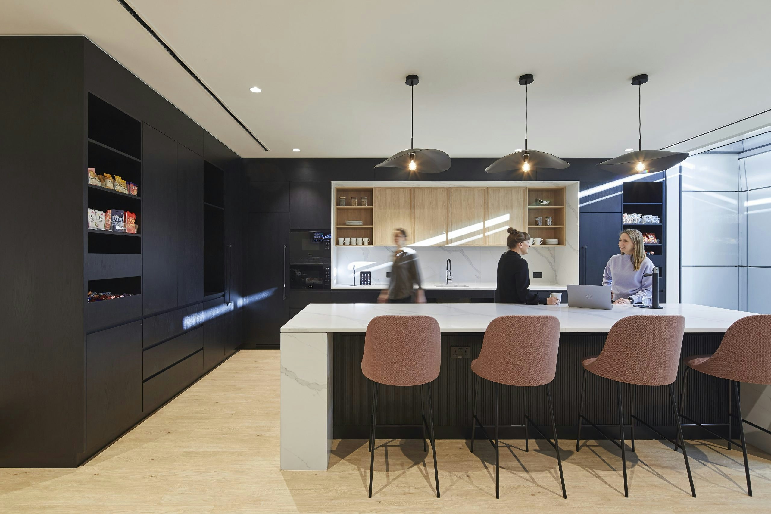
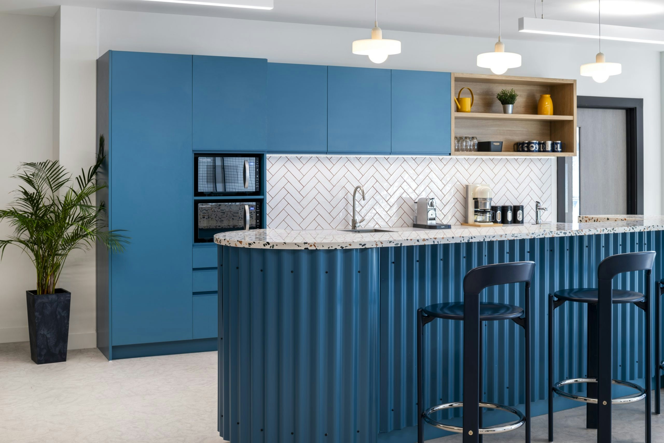
It is important to not just look at the colour of walls but to also look at injecting colour through office furniture, the ceiling (especially if you have an exposed ceiling), flooring/carpet and also by using natural surfaces/textures like rustic benches or living walls to introduce some earthy tones.
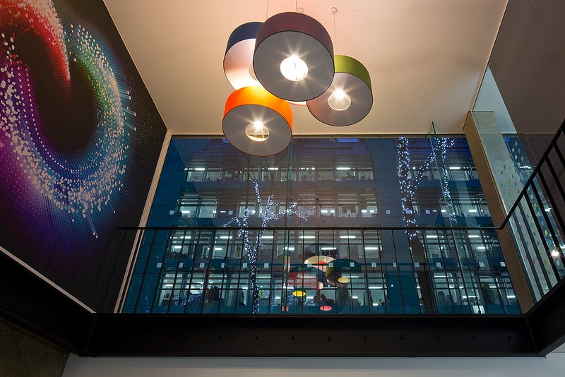
Another way of injecting some colour into the workplace is through graphics, artwork and features like living walls which have proven popular. Incorporating art into the workplace can have a majorly beneficial impact, so much so that we’ve written an entire blog post on the subject: Art in the Workplace, well worth a read, even if we say so ourselves.
As companies adopt new ways of working and with staff now increasingly spending more time away from the desk, colour has come to play an even greater role when defining certain spaces within the workplace and subtly denote what these spaces are designed for. Collaborative and agile working spaces generally utilise brighter, more vibrant colours to inject energy and creativity while areas designed to facilitate concentrated working opt for softer, more muted tones with blue and purple being popular choices.
The modern workplace provides staff with an abundance of choice and flexibility with regard to how they work and also where they work and colour has increasingly been used to symbolise this as many colours not normally associated with workplaces until recently have become commonplace. We expect this trend to continue as the colour of office design evolves the line between commercial and residential environments gets increasingly blurred and companies strive to create homely, colourful and vibrant spaces where staff love to work.
Our ethos is that every office is different and defining the colour of office design and the scheme for any specific workplace is a process that starts with a discussion on what a client wants their workplace to deliver and how they want their brand to be reflected throughout the new space.