

Most of what separates a good office from an average one is invisible on the floor plan. It shows up later, once people are in: the pod nobody uses twice because the air goes stale after ten minutes. The breakout area at the wrong end of the floor. The meeting room that works beautifully right up until someone joins by video.
These 31 office design ideas are the moves we have seen make the most practical difference across twenty years of designing and building London offices. Some are structural decisions you make once. Some cost very little and change how a floor feels within a week. Nobody does all of them – take the ones that suit your space, your sector and the way your teams work.
Each is shown through a real project we designed and built, for clients including PJT Partners, Rolls-Royce, Netflix, Snap Inc. and Criteo. Every project image on this page is a space we designed and built. If something here looks right for your space, get in touch.
1. Hybrid Working
The hard part of hybrid is not having fewer people in the building. It is that the same floor has to work on a quiet Monday with a third of the team in, and on a packed Wednesday when everyone turns up. Rows of identical desks fail at both ends of that range.
ONS data for January to March 2025 put 28% of working adults in Great Britain on a hybrid pattern, rising to 41% of those with a degree against just 4% of those with no qualifications. For professional services, financial services and legal firms the figure is typically higher still. The answer is activity-based working: a deliberate mix of settings designed for different tasks, instead of a one-size-fits-all layout.
Give people a choice of where to work
Quiet zones sit alongside collaboration areas for group work and ideation. Informal seating handles quick catch-ups, and bookable project rooms handle focused team sessions. Lockers replace personal pedestals, and a desk booking system stops overprescription while letting people pick the right setting for the work in front of them.
The settings themselves matter as much as the mix. Huddle rooms work when they are easy to find and book, have decent acoustics and a working screen. Focus zones work best when they are separated from high-traffic areas and the etiquette is understood. If the furniture is uncomfortable or the technology is unreliable, neither works.

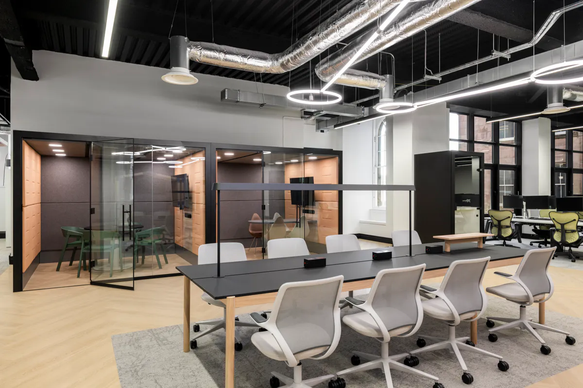
Hybrid settings at Criteo’s London office, giving teams the choice between focused work, quick stand-ups and collaborative sessions within the same floorplate.
You may have more space than you think
Remit Consulting now measures UK office occupancy from access control data as stable above 40%, hitting a record 44.1% in the week ending 30 January 2026. The British Council for Offices puts desk utilisation lower still: Tuesday to Thursday averages 40%, against 30% across all weekdays. Both point the same way. Most businesses have more usable space than they realise, and a space planning exercise done before committing to more floor area almost always finds it.
At Instinctif Partners, we halved the desk count from 200 to 100 across 12,000 sq ft on Gresham Street, and used the recovered area for a 70-seat town hall space and a broader range of work settings. During Criteo’s global transformation programme across Paris, New York and APAC, we reconfigured underused areas into a wider mix of settings while reducing the overall footprint.

At Criteo’s London office, reconfiguring underused areas created a wider range of work settings without increasing the footprint.
Our team love the new office, so much so in fact that we have seen a surge in the number of meetings being held here, and also friends coming in to take a look around, which is exactly what we wanted to achieve.
Keith Dowley, Equity Partner, DTRE
Design for the days the team is together
Hybrid offices need to perform on the busy days as well as the quiet ones. That means camera-ready meeting rooms with clean backdrops, controlled echo and one-touch join, enough enclosed capacity for the days when everyone is in, and a kitchen and social hub that can handle peak loading without overflow.
The best hybrid offices are also designed to evolve. Occupancy data and staff feedback from the first six months will tell you far more than any initial assumption. Build in flexibility at the furniture and partition level so the layout can be adjusted. For more detail, see our guide to hybrid office design. Planning a floor that works on the quiet days and the busy ones is where our office design and build service starts.
2. Reception and Arrival Experience
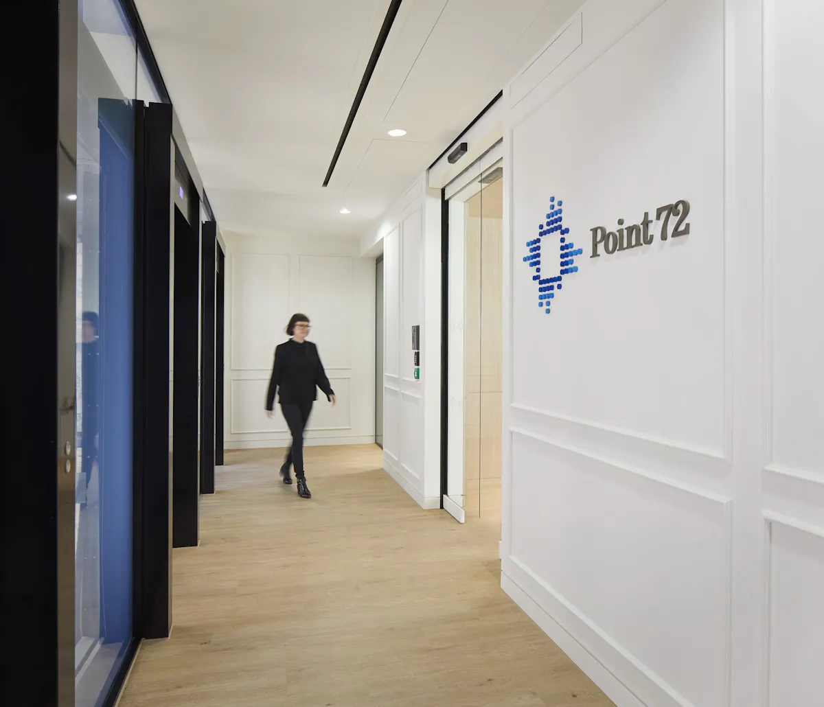
Reception is the only part of the office every visitor sees, and the only part your own staff walk through on a morning they could have stayed at home. The first 30 seconds frame everything that follows. For client-facing organisations it is part of the commercial proposition, not just an operational requirement.
The reception is more than a desk
The conventional reception – a desk, a logo, two chairs and a pile of magazines – no longer reflects how modern client meetings start. A well-designed contemporary reception is a hybrid space: somewhere to be greeted, to wait comfortably for ten minutes, to take a quick call before going in, and to register the quality and character of the organisation behind the door.

Instinctif Partners’ reception in London. A bold backlit reception desk anchors the entrance and expresses the brand at the point of arrival, without overwhelming the waiting and meeting environment beyond it.
Materials carry the most signal
Reception is where material choices register most strongly. Stone, timber, brass and considered joinery communicate quality in a way signage and graphics never quite achieve. We work with stonemasons, joiners and specialist finishers as part of most reception specifications, with the level of bespoke craft scaled to the brief and budget. At PJT Partners’ One Curzon Street office, that meant a marble reception desk and an oak-slatted café wall carrying the material language through from arrival.

Custom marble specification at a US investment firm’s Mayfair office. Sourced and cut to specification, the stone carries the material signal the brand requires at the first point of client contact.
The waiting experience matters too
A visitor who waits five minutes in a well-designed reception forms a different impression from one who waits the same time in a generic one. Comfortable seating, decent coffee or water, fast guest Wi-Fi, and visual interest at eye level – artwork, planting, a window onto the workspace beyond – all contribute. Magazines on a coffee table are not enough.
3. Brand Storytelling Through Design
Most briefs stop at the brand on the reception wall. Reception is where it starts. The rest of the floor is where the story develops.
Tell the story, do not just decorate
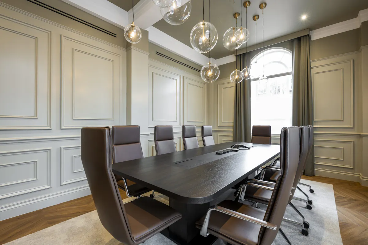
The most effective brand expressions emerge from the organisation’s actual character and history, not from a graphic refresh. For Rolls-Royce Partners Finance, the palette of black glass, white marble, timber floors and Crittall glazing across 8,000 sq ft in SW1 deliberately echoed the engineering quality associated with the brand.
Our 2,496 sq ft project for a London investment firm took the same principle further. The space is a 1930s former bank, and rather than covering that over we made it the story: the original steel vault door was retained, the architraves restored, and a meeting room built as an aluminium “safety deposit box”. It was named a Mix Awards 2025 finalist in the sub-5,000 sq ft category.

Rolls-Royce Partners Finance, London. Black glass, white marble and timber floors carrying the brand signal through material not graphic, expressing the engineering heritage in the language of the space itself.
Signage and graphics work best when restrained
The misstep most brand-led briefs make is over-application. A workplace where the brand is applied to every wall, every chair and every glass panel produces visual noise that staff stop noticing within a week. A more restrained approach – signature moments at reception, the boardroom, the social hub and the principal circulation route, with much calmer treatment elsewhere – registers more strongly precisely because it allows the eye somewhere to rest.

Adobe’s London office combines a textured stone wall and a glass panel carrying the brand mark. Strong brand presence at the entrance balanced by a calmer palette in the working zones beyond.
The brand has to live with the work
A workplace brand expression has to coexist with the actual work happening inside it. Heavy graphic treatment in a focus zone fights the cognitive task. Bright accent colours in a meeting room compete with the camera. The strongest brand signal supports the work rather than interrupting it: a confident palette, a clear material language, and a sequence of considered moments that build a coherent picture without ever feeling like an installation.
4. Acoustics and Soundscaping
Noise is the complaint we hear most often in offices that are otherwise well designed, and the one people find hardest to describe. The evidence is unusually clear on this point. Kim and de Dear at the University of Sydney analysed 42,764 office occupant surveys for the Journal of Environmental Psychology (2013, vol 36, pp 18-26) and found sound privacy was the single largest source of dissatisfaction in the workplace: 58 to 59% of people in open-plan cubicles were dissatisfied with it, against 18% in private offices. Dissatisfaction with ease of interaction, the thing open plan is meant to deliver, ran at only 5 to 8% everywhere – so the collaboration gain is small relative to the privacy penalty.
The physiological effects are measurable too. Evans and Johnson, writing in the Journal of Applied Psychology, found that clerical workers exposed to low-level open-office noise showed elevated urinary epinephrine and made around 40% fewer attempts at an unsolvable puzzle afterwards – a standard measure of motivation. Notably, they did not report feeling more stressed. The cost is real but invisible to the people paying it.
The usual error is treating acoustics as a single problem to solve when it is a spectrum to manage. A well-designed office is not uniformly quiet. It has deliberately different sound profiles in different zones: a natural hum near the social hub, controlled speech clarity in meeting rooms, near-silence in focus areas. These are acoustic neighbourhoods, and getting them right means addressing several layers at once.
Three things need to work together
Room isolation prevents sound leaking between spaces: proper seals on doors, closing gaps at partition heads, and the right glazing specification for meeting rooms. Many fit outs fail here not because of poor products but because of poor acoustic installation.
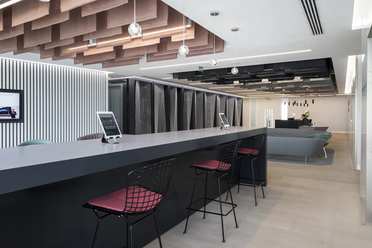
Reverberation control reduces the bounce of speech off hard surfaces. Open plan offices with polished concrete floors, glazed partitions and hard ceilings are particularly vulnerable. Fabric-wrapped panels, upholstered furniture, curtains and acoustic ceiling baffles all absorb sound energy and prevent the prolonged echo that makes conversation exhausting. The most effective solutions double as design elements: slatted timber baffles, upholstered feature walls, and soft furnishings chosen partly for their acoustic properties.
Sound masking smooths out the distracting spikes caused by a single conversation cutting through an otherwise quiet floor. These systems emit a gentle broadband signal that raises the ambient noise floor just enough to reduce the intelligibility of distant speech, without making the space feel loud. On large open plan floors with high ceilings, sound masking is often the single most cost-effective acoustic intervention available.

The meeting suite at Oil Spill Response’s 6,000 sq ft Southampton office, delivered on an eight-week programme. Layered materials give speech clarity and acoustic privacy without losing visual transparency.
Different zones, different audio character
The most refined acoustic designs treat different zones as having different intended audio characters. The social hub has a comfortable buzz. The collaboration zone has clear speech intelligibility for the people in it but is acoustically separated from the desks. The focus zone is quiet. Reception has a calm hospitality character, sometimes with soft ambient music. Each is a deliberate design output, not an accident of construction.
Ambient music in shared spaces is a small detail that consistently registers. The volume needs to be low enough to support conversation, the playlist considered instead of generic, and speaker placement designed for even coverage. We design these systems into the AV specification instead of leaving it to whoever has the Bluetooth.
Pods carry a growing share of the acoustic load
Focus pods and phone booths are an increasingly critical part of the acoustic toolkit, particularly as voice-based AI tools become more common. Staff dictating, prompting and reviewing responses out loud create an acoustic load open plan offices were never built for. At OSRL we positioned wood-slatted soundproof phone booths just off the main workspace, so private calls are a few steps away rather than a walk across the floor. Idea 17 covers pod specification in full, including the one detail that decides whether they get used at all.
Your ceiling can do a lot for acoustics
Ceilings are one of the most underused surfaces for acoustic treatment in commercial interiors. Slatted timber baffles, coloured coffers and suspended panels look striking and absorb reverberation where hard floors and glazed partitions would otherwise create uncomfortable echo. Avoid glass-on-glass reflections where possible: a meeting room fronted by a glazed partition and backed by another creates a reflective chamber that defeats even good internal acoustic specification.
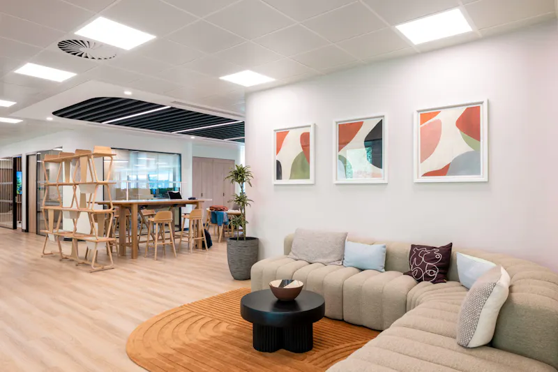
A feature ceiling with slatted timber and integrated lighting at the Global Innovation Institute’s 25,000 sq ft London office. The baffle system absorbs reverberation from the hard floor below while functioning as the primary design statement in the collaboration zone.
For a fuller treatment, see our guides on understanding workplace acoustics and reducing noise levels in offices.

5. Meeting Spaces
Meeting spaces are where the gap between how a floor was designed and how it gets used shows up fastest. If your booking data says most meetings are two or three people, a floor full of eight-person rooms is a misstep you can see coming before a wall goes up.
The common failure modes are well documented: rooms too large for how they are used, AV that does not work reliably, acoustics that make remote participants feel like an afterthought, and booking systems that bear no resemblance to how people organise their time.
Small rooms get used the most. Spec them properly
Small meeting and focus rooms of two to four seats handle the majority of daily use in most offices. They need to be easy to find, easy to book or available on a walk-up basis, and properly kitted with a screen plus power and data for laptop connections.
Boardrooms and client rooms: first impressions count
Formal boardroom and client presentation suites need a higher quality of finish, better lighting control and a more considered AV setup. For a Mayfair private investment firm, the boardroom specification centred on a custom 9.2-metre Corian table with leather inlay, commissioned artwork and a lighting scheme that shifts between presentation mode and client dining without any visible technology. At a US investment firm’s 4,000 sq ft Mayfair office, the same brief resolved differently: a 20-seat boardroom around a Brunner Ray table with Fina chairs. The brief for these rooms is as much about the experience they create as the meetings they host.
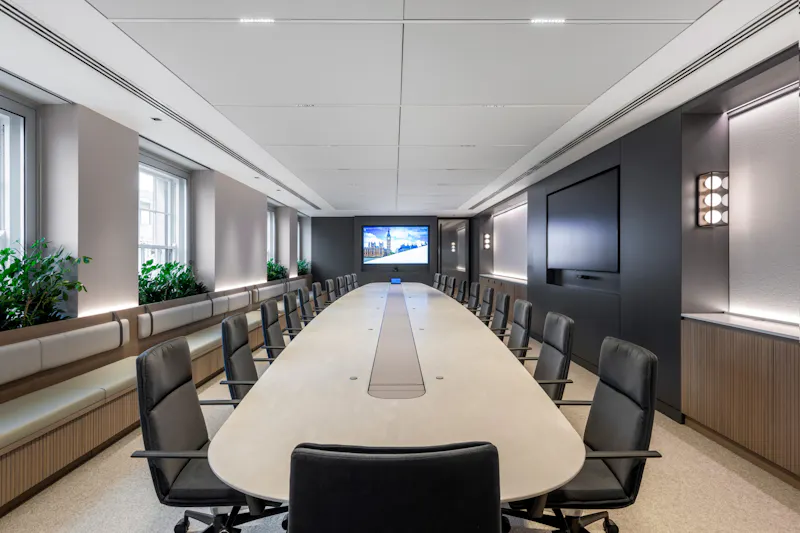
A custom 9.2-metre Corian boardroom table with leather inlay at this 5,000 sq ft Mayfair investment firm. The room functions as both a board-level meeting space and a client hosting environment, with a lighting scheme that shifts between modes without visible technology.
We had a vision of a new office space that supports modern ways of working, inspires our team, and leaves a lasting impression on our clients. K2 Space took our dream and turned it into a masterpiece!
Senior Vice President Real Estate, PJT Partners
Rooms built for video calls, not rooms with a camera bolted on
Hybrid meeting rooms require a different design discipline entirely. Camera placement at eye level, clean backdrops free from distracting visual noise, controlled echo through soft finishes and ceiling baffles, and one-touch join from any device are the baseline. AI meeting tools providing live transcription and automated summaries are now standard in many of our clients’ environments and need accommodating in the AV specification from the outset. The biggest trap is treating AV as a retrofit: bolting cameras and screens onto rooms designed for in-person use will always produce a second-rate hybrid experience.

Glass-walled meeting rooms at a US hedge fund’s 25,000 sq ft London SW1 office, with layered acoustic treatment designed so remote participants see and hear as clearly as those in the room. Camera height, backdrop composition and lighting angle were all tested with live calls before handover.
A place to host clients properly
Client suites adjacent to meeting rooms reduce switching time between pitches, workshops and informal conversations. At DTRE’s 11,000 sq ft Mayfair office, a prep pantry sits beside the suite so refreshments appear on cue without disrupting the meeting in progress. A small prep pantry, concealed storage for glassware and AV spares, and a lighting scene that shifts from working mode to hosting mode all contribute. For professional services firms, the hosting environment is part of the commercial proposition.
Room booking and utilisation data should inform design decisions from the start. If sensor data shows 70% of bookings are for two to three people, designing a floor full of eight-person rooms is a known misstep before a single wall goes up. See our guides on space planning and workplace technology for how we approach this.
6. Social Hubs
A social hub is the most productive square footage in most buildings, and the space most often got wrong: a kettle and a couple of bar stools in a leftover corner that nobody uses except to make a coffee and leave.
The commercial case is strong. Gallup’s 11th Q12 meta-analysis, covering 183,806 business units, found that top-quartile engaged teams are 18% more productive on sales, 14% more productive on production records and 23% more profitable than bottom-quartile teams. Social connection at work is one of the primary drivers of that difference, and the social hub is where it happens: informal knowledge sharing, relationships between teams that rarely meet formally, and the daily culture no town hall can replicate.
One space, three jobs
The design brief has three distinct modes: workspace by day, with cafe-style tables and good laptop connectivity; informal meeting space through the middle of the day, with mixed seat heights for standing catch-ups alongside seated conversations; and social and event space by late afternoon, with integrated AV and enough clearance for a team gathering or client reception. Layered lighting, mobile furniture and integrated AV make the switch between modes effortless.
Position the hub on the main circulation spine, not tucked away at one end of the floor. When it is the natural place to pass through, it becomes the natural place to stop. A good coffee offer, a water point and fast Wi-Fi are the basics. Get those right and the space fills itself.
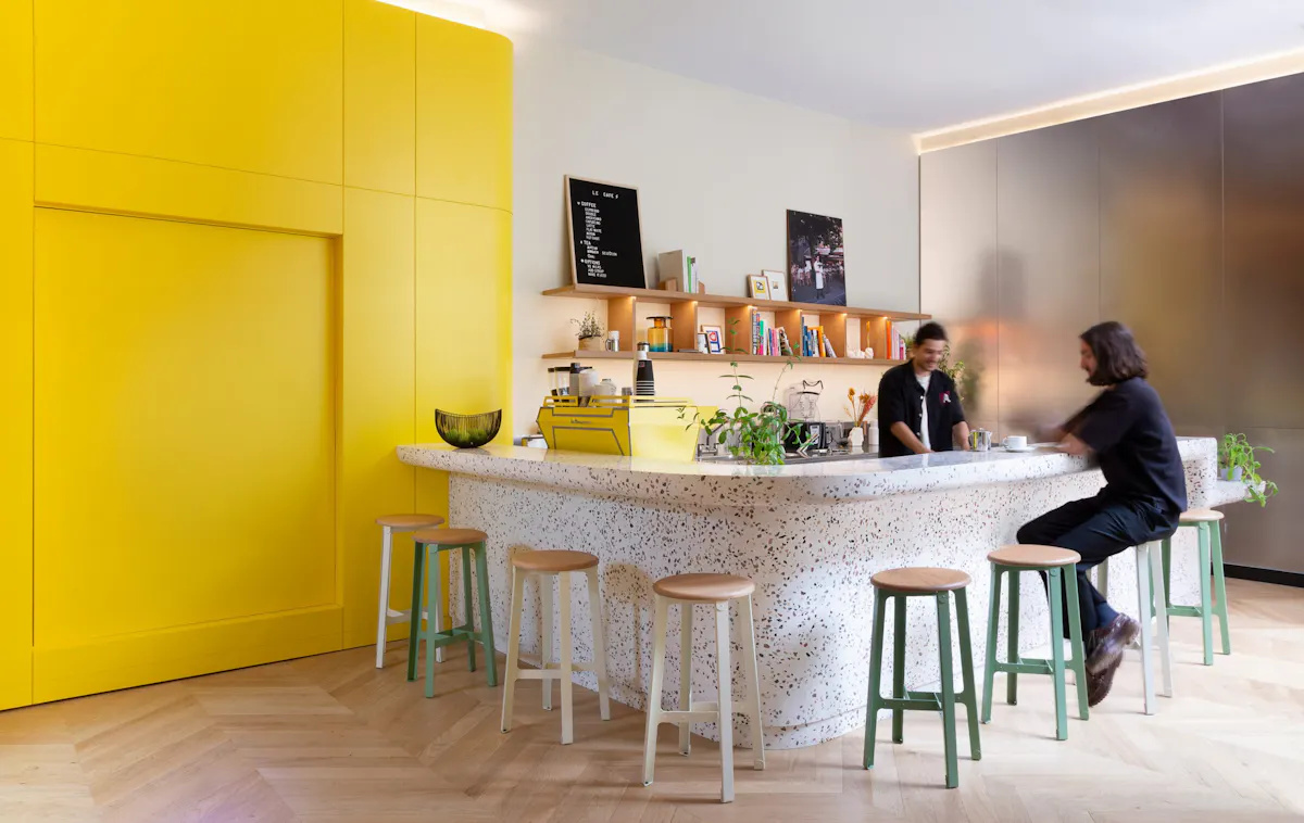
Löfbergs’ 4,000 sq ft London office, delivered in three months, uses a central social hub as the spine of the floor. For a coffee roaster founded in 1906, that meant a bespoke tasting kitchen and coffee bar at the centre of the plan rather than at the edge of it.

Dentsu’s 7,000 sq ft Edinburgh fit-out at The Stamp Office, a Georgian building of 1819 on Princes Street, uses an elegant coffee space as a natural gathering point. Vibrant tones in the hub give way to calmer palettes as you move towards focus spaces.
Hosting clients in-house
For professional and financial services clients, the social hub also functions as a client-facing space. A bar area or servery that allows in-house events – drinks after a pitch, a deal close celebration, a client breakfast – adds a level of polish external venues rarely match. Plan acoustics and licensing early, use durable easy-clean surfaces, and have a simple operating plan covering who opens the space, who closes it and where stock lives.

Platinum Equity’s 11,000 sq ft Mayfair office at 5 Hanover Square includes a social and entertaining area that works for client hosting without feeling separate from the workspace. A modular back bar shifts from coffee to cocktails with minimal changeover. The firm reports near-total daily office attendance across its London team.
As always it has been a pleasure working with the K2 team on this project. Their great designs, attention to detail and professionalism have delivered an outstanding office for our team and clients once again.
Robert Klap, Partner, Platinum Equity
Somewhere to sit that isn’t a desk
Breakout spaces close to the main workspace, not at the far end of the floor, give people somewhere to step away from a screen for ten minutes without leaving the building. Soft seating, warm lighting and device charging make the difference between a space that gets used and one that gets ignored.

The Global Innovation Institute’s 25,000 sq ft London office integrates ergonomic soft seating into multiple breakout zones. Short periods of mental rest close to the workspace, not a single dedicated room at the far end of the floor.
See our articles on creative breakout areas and workplace wellbeing for more.

7. Temperature, Air Quality and Thermal Comfort
For a knowledge business the arithmetic is blunt: your payroll dwarfs your rent, so anything quietly taking a few percent off the effectiveness of that payroll is expensive. Air quality does exactly that.
Harvard’s COGfx study, published in Environmental Health Perspectives, found cognitive function scores were 101% higher – effectively double – in a simulated green office with enhanced ventilation and low VOC levels, compared with a conventional office. Doubling outdoor air ventilation alone accounted for a 25% average increase, with the largest gains in crisis response, information usage and strategy. It is worth knowing the study was a controlled laboratory simulation with 24 participants, funded in part by an HVAC manufacturer, so treat the headline figure as directional rather than a guaranteed return. The direction, though, is consistent across the wider literature.
Fresh air matters more than most people realise
The design response is not simply specifying a better mechanical system, though that matters. It is the relationship between indoor and outdoor air: whether windows can be opened, whether terraces are positioned to let airflow reach the interior, whether courtyards and atria create stack-effect ventilation that reduces dependence on mechanical systems in milder weather. When natural ventilation complements HVAC rather than competing with it, the result is a workspace that feels noticeably fresher.
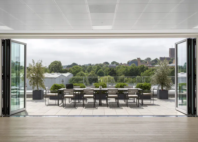
Cube Real Estate at 2 Guildford Business Park. Across four floors, openable windows, a roof terrace and considered airflow design connect the workspace to the outdoors – a result standard HVAC specification alone cannot achieve.
One temperature setting doesn’t work for an entire floor
Thermal zoning is a related issue most occupants notice immediately but few offices address properly. Different parts of a floor have different solar gain, different occupancy patterns and different equipment loads. A one-size-fits-all HVAC zone leaves perimeter desks too hot on sunny afternoons and deep-plan desks too cold in the morning. The solution is finer-grained zoning at design stage, combined with occupant control at desk or zone level where possible.
Measure what’s happening
Real-time monitoring makes the invisible visible. CO2 sensors and temperature monitors give facilities teams the data to act before occupants feel the effects, and give occupants the information to understand why a room feels uncomfortable. Dashboard displays showing live air quality in meeting rooms and common areas are an increasingly standard feature in well-specified London offices, and a straightforward addition during a fit out or refurbishment.
For organisations in older buildings, a refurbishment is typically the point at which these systems can be upgraded properly. Retrofitting CO2 sensors, upgrading HVAC controls and improving the connection between indoor and outdoor air all deliver returns in occupant satisfaction. Talk to us about your project.
8. Sustainable Design
For a lot of London occupiers this stopped being a preference and became a reporting obligation. It also runs from how materials are sourced through to the energy the finished space uses over its life, which is considerably further than swapping the lighting.
What your office is built from matters
Embodied carbon – the carbon emitted in the production, transport and installation of materials – is the area receiving the most attention in 2026. Specifying FSC-certified timber, low-VOC finishes and recycled-content materials reduces embodied carbon without compromising design quality. We hold long-standing relationships with manufacturers operating circular programmes and take-back schemes, and can advise on specification choices that reduce waste at the outset.
The cheapest carbon saving is usually the furniture you already own. Across our projects we have reused more than 1,000 items of existing furniture rather than sending them to landfill. At IMSO’s 3,100 sq ft London SE1 office we retained and reused the existing glass partitions. At Dentsu Edinburgh we reused as much existing furniture as possible in line with the client’s ERG guidelines, relocating some pieces from other Dentsu UK offices. At Instinctif Partners, recycled and repurposed furniture formed a significant part of the specification.

Circular design principles in practice at Santen Pharmaceutical: modular materials, low-VOC finishes and FSC-certified timber reduce environmental impact without compromising design quality.
Waste less, build smarter
Circular design principles are changing how fit-outs are approached structurally. Modular carpet tiles replaced panel by panel instead of full floor replacement. Furniture designed for disassembly and reuse at end of life. Demountable partitions that can be reconfigured without generating waste. These are not aspirational concepts: they are available now, work within standard commercial budgets, and make a meaningful difference to the environmental footprint of a project.
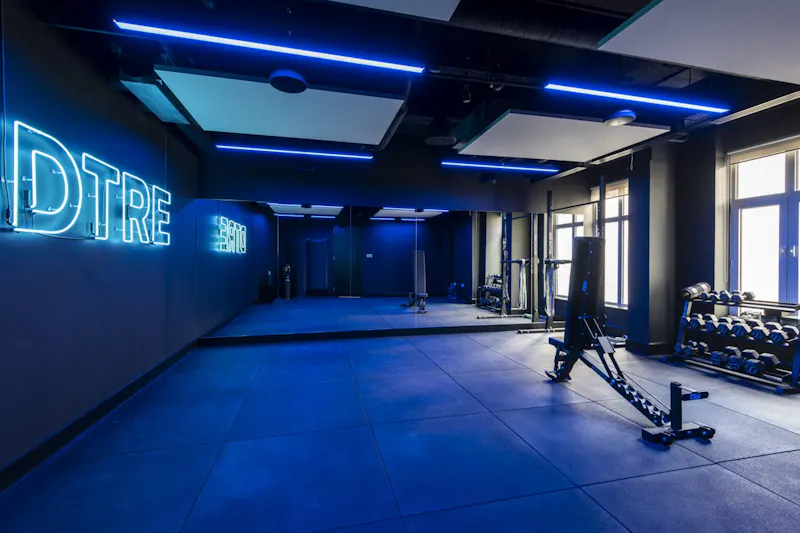
DTRE’s 11,000 sq ft Mayfair office achieved BREEAM Very Good accreditation on a 16-week programme, integrating sustainable specification across end-of-trip facilities, materials and operational systems. It was a Sustainable Design Awards 2024 finalist. High-quality finishes and responsible specification are entirely compatible.
Lower running costs over time
Operational energy performance is the other major lever. LED lighting with daylight-linked dimming, smart building management systems that adjust HVAC and blinds in response to real-time occupancy, and well-insulated partitions all reduce energy consumption over the life of the fit-out. Payback periods have shortened significantly as energy costs have risen.
We have delivered BREEAM-accredited projects and can work to a sustainability brief at varying levels of ambition and budget. We will be direct about what is achievable within your programme and what the trade-offs are, rather than making commitments that are difficult to substantiate. For more, see our article on designing sustainable offices, our fit-out costs guide and our sustainability commitments.

9. Technology and Smart Office Design
Office technology works on two levels that are easy to conflate. There is the enabling layer of AV, connectivity and booking that makes the office function, and the intelligent layer of AI, analytics and building management that makes it learn and adapt. Both matter, but failing at the first makes the second irrelevant.
Get the basics right first
Every meeting room in a well-designed office needs a reliable video bar with one-touch join, camera at eye level, controlled echo and a single cable for laptop connection. Desk and room booking needs to be visible, accurate and simple enough that people use it rather than working around it. Wi-Fi needs to be seamless across the entire floor, including in booths, pods and breakout areas where it is most frequently missing. None of this is complicated, but it requires planning from design stage instead of being specified as a retrofit.

Snap Inc.’s 102,000 sq ft Paris headquarters, in a listed Hôtel Particulier on rue d’Aguesseau. Smart connectivity was integrated across a heritage building working with 32 manufacturers, on a four-week install.
K2 Space managed the design and build process seamlessly ensuring that there was no disruption to our normal business activities and handed over a fantastic, vibrant new space that our staff love.
Carolyn Kaiser, William Blair
Let the building manage itself
AI-powered building management is where the most significant operational gains are now being made. Systems that predict peak demand, release no-show bookings automatically, adjust HVAC and lighting in real time based on occupancy, and recommend optimal desk clusters for project teams are proven in commercial environments.
Real-time occupancy monitoring tells facilities teams how the space is actually used and lets them adjust services accordingly. Automated booking release frees up no-show meeting rooms after a few minutes. HVAC and lighting automation adjusts conditions in response to actual occupancy rather than a fixed schedule.
Be careful with the savings claims here, because the range quoted in the market is wider than the evidence supports. The Carbon Trust puts optimum-start controls, rather than fixed time controls, at around 10% of HVAC energy cost. US Department of Energy modelling puts a full, correctly commissioned controls package at an average 29% of whole-building energy use. A two-year Lawrence Berkeley field trial of occupancy-based HVAC control measured 6.1% whole-building savings in practice. The honest answer is that the return depends heavily on how well the system is commissioned, and that commissioning is where most projects underinvest.
Integration matters more than individual components
Where most smart office implementations go wrong is treating each component as a standalone system. Lighting, HVAC, room booking, occupancy, AV and access control all working independently produces a fragmented experience and limits the operational benefit. The best implementations integrate these through a single platform, with consistent user interfaces and shared data. The integration is more valuable than any individual component.
Make the important stuff visible
Technology walls and large-format dashboards serve a related purpose. In trading environments, media companies, creative studios and any organisation where the state of a project or market needs to be always visible, a well-designed technology wall removes the overhead of scheduled alignment meetings. Pair it with a standing zone and adjacent collaboration space so passive information display can shift into active decision-making without anyone having to move floors.

Technology walls integrated into the Paris headquarters, letting project groups see critical information and move into active decisions without scheduling a meeting to discuss what everyone can already see on a screen.
For AV specification advice, governance frameworks and implementation roadmaps, see our smart office design and workplace technology guides.

10. Biophilic Office Design
A few statement planters dropped into reception will not change how a floor feels. Distribution is what does, and the research base behind biophilic design is now substantial. The Human Spaces report surveyed 7,600 office workers across 16 countries and found those in environments with natural elements reported 15% higher wellbeing, 15% more creativity and 6% higher productivity than those without. The same study found 66% of UK workers reported no natural light at all in their workspace, the worst result of the 16 countries surveyed.
Plants are the starting point, not the finish
The usual error is treating it as a planting exercise. What works is distributing natural elements throughout the floorplate so they are encountered constantly instead of admired once: planting around desk clusters, timber finishes on partitions, stone or terrazzo on circulation routes, and clear sightlines to windows from every desk.
Maintenance is the detail most projects underestimate. Dying plants are worse than no plants, and a planting scheme without an ongoing care contract will deteriorate within months. We build maintenance into every biophilic specification at design stage, with plant species selected for the light and humidity conditions of each zone.
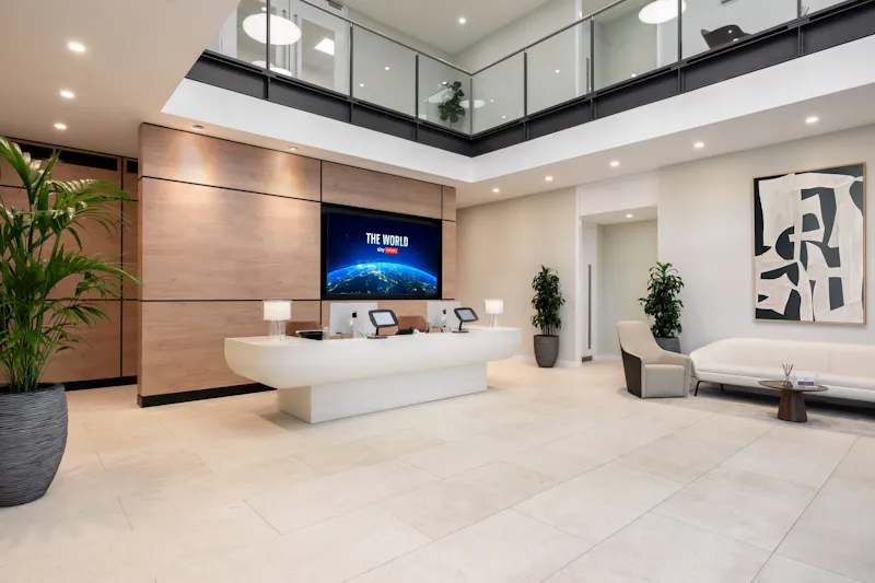
Distributed planting at the Global Innovation Institute’s 25,000 sq ft London office. Planters integrated at desk-cluster level, partition planting along circulation routes, and direct sightlines to glazing from every desk.
Living walls earn their place when they are visible
Living walls are a useful design statement when positioned where people spend time. A green wall in a stairwell nobody uses delivers very little. The same wall at the end of a main circulation axis, visible from collaboration areas and the social hub, becomes a daily restorative element. We typically specify living walls for spaces combining high visibility with high dwell time: social hubs, primary breakout zones, and reception spaces with seating.
A successful green wall starts with plant species matched to the light and humidity of the position. Integrated irrigation is mandatory – hand-watering does not work at the scale of a wall. Light levels at the wall surface need verifying, with supplementary grow lighting where natural light is insufficient. None of this is optional. Where a fully live wall is impractical, preserved moss walls deliver much of the visual benefit with significantly lower maintenance overhead, and acoustic benefit comparable to a live wall.

A living installation at Criteo’s 20,000 sq ft APAC offices in Singapore and Tokyo, positioned for daily visibility from the workspace and circulation route. Species selection was specified together with the lighting plan to ensure long-term viability.
Natural materials carry the same idea
Where physical planting is impractical, natural materials carry much of the same psychological benefit. Timber-finished partitions, stone-textured wall surfaces, exposed concrete with timber accents, and woven natural fibres in upholstery all signal a connection to the natural world that LVT and white plasterboard do not. The effect compounds when these materials are used consistently across the floorplate instead of dotted about as accents.
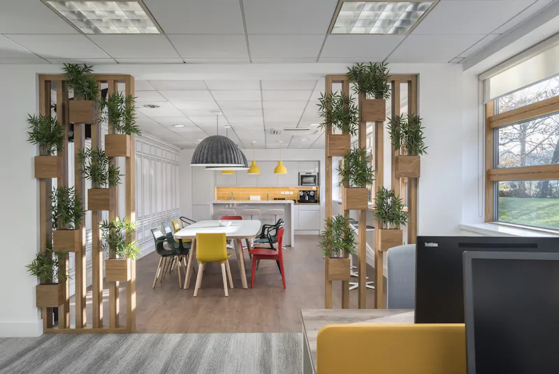
Timber, stone and woven textures applied consistently across Santen Pharmaceutical’s office. Natural materials carrying the biophilic effect into spaces where planting alone would not be enough.
For more detail, see our guide to biophilic office design.

11. Natural Light, Circadian and Adaptive Lighting
Natural light beats the cafeteria, the gym and the premium perks when you ask staff what they want. In a poll of 1,614 North American employees reported by Jeanne C. Meister in Harvard Business Review, access to natural light and views of the outdoors ranked as the number one workplace attribute, outranking on-site cafeterias, fitness centres and childcare. Separate research cited in the same article links poor daylight access to eyestrain, headaches and afternoon drowsiness.
Daylight is one of the few workplace inputs that costs nothing once the building is correctly configured for it, and it pays back continuously throughout the working day.
Put the people near the windows
The single most effective decision in any space plan is the placement of desks relative to glazing. Pushing desks towards the perimeter, with meeting rooms and ancillary spaces in the deeper-plan core, gives the highest possible proportion of staff direct daylight through the day. Glazed partitions on internal meeting rooms let that light penetrate further into the floor rather than being absorbed by solid walls.

At Netflix Madrid, part of a multi-city programme, desks were positioned along the perimeter glazing with meeting rooms drawn back into the core. The maximum number of staff get direct natural light throughout the working day.
Glazed partitions earn their cost
Glazed meeting rooms cost more than solid-walled equivalents, but the daylight transmission they provide to the wider floor is a meaningful return on that premium. We typically specify acoustic glazing with manifestations or fritted patterns for privacy where needed, retaining light transmission. On some projects we use smart glazing that switches from transparent to frosted on demand, giving meeting privacy without sacrificing daylight elsewhere. At IMSO, the existing glazed partitions were retained and reused rather than replaced – the sustainable option and the daylight option in the same decision.
Glare is a separate problem
The opposite misstep is over-glazing without proper solar control. South and west-facing perimeters with no blind strategy create afternoon glare that drives people away from the very desks the design was trying to prioritise. Internal blinds, external shading, or selective film on the most exposed elevations protect against glare without losing the underlying daylight benefit. We model solar exposure at design stage so the blind and shading strategy suits the elevation, the time of year and the working pattern of the team.
Circadian lighting supports the body’s natural rhythm
Artificial lighting that mimics the natural progression of daylight through the day supports better cognitive performance, mood and sleep quality than fixed-spectrum lighting. The principle is recognised in the WELL Building Standard v2 as Feature L03, Circadian Lighting Design, measured in Equivalent Melanopic Lux, and is increasingly specified as a baseline rather than a premium addition.
A circadian system varies colour temperature and intensity through the day. Cooler, brighter light in the morning supports alertness and concentration. Neutral light through the middle of the day sustains performance. Warmer, gentler light in the late afternoon supports the natural wind-down towards evening. The shift is gradual and largely unconscious, but the cumulative effect is meaningful.
Daylight-linked dimming is the best of both
The most effective lighting designs treat circadian artificial lighting as a complement to natural daylight, not a replacement. Daylight-linked dimming reduces artificial output when daylight is available and shifts the spectrum to match the daylight character. The result feels more like being outside than under a fixed grid of fluorescents.

Layered lighting at the Global Innovation Institute. Natural daylight from the perimeter, ambient lighting tuned to circadian principles, and task lighting at desk level give every staff member control over their local environment.
Task lighting at the desk level
Adjustable task lighting at each desk lets individuals fine-tune their local environment beyond what the ambient system delivers. This matters particularly for neurodivergent staff and older workers, both of whom typically benefit from higher local illumination than the standard ambient setting provides. We specify this as a baseline wherever the budget allows. See our article on workplace wellbeing for the broader case on daylight and staff health.
12. Ergonomics and Sit-Stand Working
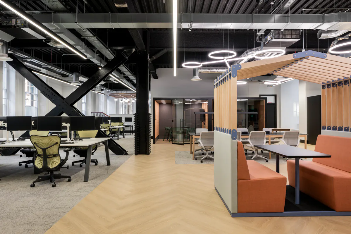
Giving people height-adjustable desks is not the same as getting them used, and the ergonomics evidence keeps sharpening on that point. A Griffith University randomised trial published in Applied Ergonomics (DOI 10.1016/j.apergo.2025.104670) tested a prescribed 30 minutes sitting / 15 minutes standing ratio against a self-selected approach across 56 desk workers who had experienced lower back pain in the previous month.
Over three months, the prescribed routine reduced worst daily pain by 1.33 points out of 10 and average pain by 0.83, and also improved job stress, concentration and presenteeism. The self-selected group reduced worst pain by only 0.69, though it did cut overall sitting time. Adherence was higher in the prescribed group. The design consequence is that sit-stand infrastructure works when standing is the default rather than the exception, and the wider environment has to support that.
Specify the desk for the way it will be used
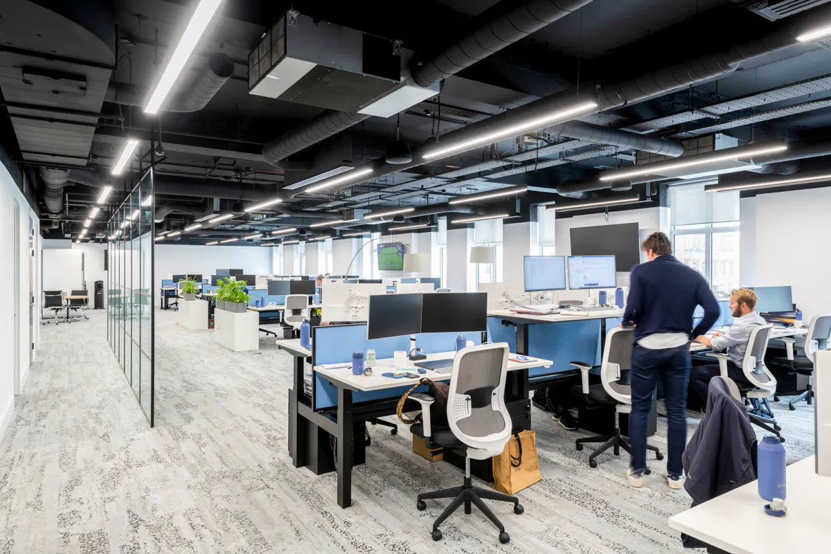
The first generation of sit-stand desks were specified individually as wellness add-ons for staff who requested them. The current standard is electric height-adjustable desks across the whole floor, with memory presets so switching between sitting and standing height is a single button press. The cost difference per desk has narrowed significantly, and the operational benefit of every desk being usable by every staff member regardless of stature or preference is substantial.

Electric height-adjustable desks specified as standard at a US hedge fund’s London office. Memory presets let each user switch between sitting and standing height with a single touch.
Chairs are the half of the equation that gets less attention
The chair specification matters as much as the desk. A well-specified task chair adjusts at seat height, seat depth, lumbar position, armrest height, armrest width, headrest, recline tension and recline lock. Cheaper chairs that adjust only on the basic axes force the user to adapt to the chair rather than the chair to the user, and the consequence over an eight-hour day is musculoskeletal strain.
As a MillerKnoll authorised dealer with more than 25,000 workspace installations behind us, we work with manufacturers including Senator, MillerKnoll (Herman Miller, Knoll) and Vitra to specify task chairs matched to the working pattern of the team. At Cantillon Capital Management, that meant Knoll Tone sit-stand desks paired with Herman Miller Aeron chairs across a 10,000 sq ft SW1 floor. For trading floors and intensive screen-based work we recommend chairs at the higher end of the ergonomic specification; for lighter touchdown use, simpler chairs are appropriate. One chair type across the whole floor is rarely the right answer. See our office furniture service for how we approach specification.

Task chairs at PJT Partners’ London office, specified to match the intensity of trading floor and analytical work. Full adjustment across all axes, supporting an eight to ten hour working day without cumulative strain.
Build movement into the floor
The deeper insight from the sit-stand research is that posture variation matters more than standing in itself. The best designed offices encourage movement through the day: standing meeting tables for short stand-ups, walking routes that connect the social hub to the work zones, and breakout spaces far enough from desks that staff naturally walk to reach them. Movement is a design output, not a behaviour to be policed. For more, see our article on workplace wellbeing.
13. Wellness and Mindfulness Spaces
Nobody works at full intensity through a nine-hour day, and the standard breakout space – loud, social, usually next to the kitchen – is not where anyone recovers. A dedicated quiet room has gone from Silicon Valley curiosity to standard inclusion in well-specified London offices for that reason alone.
The case is stronger than it looks. CIPD’s Health and wellbeing at work 2025 found mental ill health is the leading cause of long-term absence in the UK, cited by 41% of organisations among their top three causes, with average absence at 9.4 days per employee – the highest in more than 15 years. Giving staff somewhere to step out of the workspace during a difficult moment is a meaningful preventative measure. Wellness rooms are also used for nursing parents, staff managing chronic conditions, prayer and meditation, recovery from migraine or fatigue, and private medical or HR conversations.
Specify the room properly, not generically
A wellness room that doubles as overflow meeting space delivers neither function well. We specify them as single-purpose spaces with a comfortable single sofa or chaise, soft layered lighting rather than the standard ceiling grid, acoustic specification well above the rest of the floor, blackout blind or curtain capability, a small surface for a glass of water, and a power point. A booking system with privacy, so the booker is not visible to colleagues, helps where staff feel uncomfortable being seen to use the room. At Altum Capital, a dedicated wellness room was included within just 3,000 sq ft – the provision is not a function of floor area.

A wellness room at Netflix Madrid specified for genuine recovery use. Soft seating, layered lighting, blackout capability and acoustic isolation well above the surrounding floor.
Position the room where it will be used
A wellness room at the far end of the floor next to the toilets sees less use than one within easy reach of the main workspace but visually separated by partition and material change. The threshold matters. People will use a room they can reach in a minute. They will not use a room that requires a visible journey across the floor.

A quiet recovery space at Javelin Commodities in St James’s, positioned within the main floor plan instead of relegated to a far corner. Accessible without a visible walk across the workspace.
Mindfulness spaces serve a different purpose
A mindfulness space is related to a wellness room but serves a different purpose. Where a wellness room is for individual recovery, a mindfulness space is designed for brief, regular use by multiple staff: a five-minute reset between meetings, a meditation pause at lunch, a moment of quiet before a difficult conversation. Research collected by the American Psychological Association links regular short-form meditation to reductions in stress, improvements in attention regulation and better emotional self-management.
Design for short, repeated use
A mindfulness space that takes five minutes to set up will not be used in a five-minute window. The design needs to support immediate use: a quiet enclosed space, soft floor surface for those who want to sit or stretch, a couple of cushions or low seating, dim warm lighting on a single switch, and acoustic isolation from the surrounding floor. Some clients add a small library of guided meditation audio accessible via a tablet in the room.

A mindfulness space at the Roald Dahl Story Company’s 4,500 sq ft Marylebone office. Soft surfaces, low seating, dimmable warm lighting and acoustic isolation supporting a quick reset between meetings.
Multifaith and prayer requirements
For organisations with a multifaith workforce, the same space typically functions as a prayer room. Design considerations include orientation for prayer towards Mecca, a small ablution facility nearby where possible, storage for prayer mats, and scheduling protocols that respect different daily prayer times. We design these spaces with input from the client’s staff representatives so they meet actual use requirements instead of assumptions.

14. Neurodiverse Design
CIPD estimates around 1 in 5 people are neurodivergent in some way. Standard open plan, with its unpredictable noise and no retreat, is the hardest environment for a significant share of that group. ACAS guidance on reasonable adjustments recommends providing a quiet place to work away from distractions and private quiet space for sensory overload – which is a design instruction as much as an HR one. Providing a genuine range of sensory environments across the floor, rather than a single open-plan setting, is one of the most effective interventions available. See our guide to workplace neurodiversity.
Two types of space, deliberately different
The design response is typically two types of space. A low-stimulation room with soft surfaces, muted colours, dimmable warm lighting, and minimal visual or acoustic input. And a focused stimulation space for staff who concentrate better with controlled sensory input: tactile elements, controllable music or ambient sound, more visual texture. Different brains need different environments, and the well-designed office provides both.

A low-stimulation sensory space at Netflix Madrid. Muted colours, soft seating, controllable warm lighting and acoustic isolation. Designed as a deliberate alternative to high-stimulation open plan rather than an overflow space.
The wider floor matters too
Sensory rooms are useful, but they are not a substitute for designing the wider floor with neurodiverse needs in mind. Practical baseline measures include adjustable task lighting at every desk, a clear sound zoning strategy so noise levels are predictable in each part of the floor, planted screens or partitions to break up large open sightlines, and enough focus pods and quiet rooms that any staff member can reach a low-stimulation environment within a minute. These measures benefit everyone, but they are particularly important for staff who would otherwise find standard open plan difficult to work in.

Softer lighting and screening create a predictable low-stimulation work zone at Cantillon Capital Management’s 10,000 sq ft SW1 office. A reliable place to work alongside the main open plan, giving staff a predictable environment without isolating them from the team.

15. Accessibility and Inclusive Design
Inclusive design costs a fraction at design stage of what it costs to retrofit, and an office usable only by a narrow profile will not hold a diverse workforce.
The baseline is higher than the legal minimum
Standard considerations include step-free access throughout the floor, not just to the entrance; accessible WCs at every level; hearing loop systems in main meeting rooms and reception; contrasting colour and tactile changes at thresholds for visually impaired staff; and signage combining text, symbols and braille where appropriate. Doors should be specified with low-effort opening or automatic operation on main circulation routes.

Wide circulation routes, step-free transitions and clear sightlines at DTRE’s Mayfair office, designed in from the start. Accessibility specified at planning stage instead of added as a retrofit.
Furniture that works for different bodies
Height-adjustable desks are inherently inclusive, accommodating standing and seated users and a wide range of statures. Task chairs should include options with different seat depths and a higher gas-lift range for taller staff. Meeting room chairs should include some with armrests at the right height for assisted standing. We work through these details at FF&E specification stage instead of ordering one product across the whole floor.
Provision for nursing parents
Dedicated lactation rooms are an inclusion any office of 100+ staff should plan for. They need privacy – a lockable door, not a curtain – a comfortable chair, a small fridge for milk storage, a sink nearby, and a power point. We typically combine this function with the wellness room specification on a bookable basis, rather than dedicating a separate space that goes unused much of the time.
A flexible floor is an inclusive one
A dedicated prayer or multifaith room sits naturally alongside a strong wellness and quiet room offer. Together they give staff the flexibility to step out of the open plan for whatever reason they need, without that need being visible or having to be justified to a manager. That flexibility is one of the most consistently appreciated features of well-designed contemporary workplaces.
16. Home Comforts and Residential Touches
Your office is competing with a comfortable spare room, and that has moved the bar for what counts as worth the commute. The most successful contemporary workplaces do not feel like offices in the traditional sense.
The discipline goes by various names – resimercial design, hospitality-led design, the home-from-home office – but the principle is the same: replace the impersonal commercial palette with the warmth, texture and considered detailing of a residential or hospitality space, while retaining the technical performance the work requires.
The pieces that make the difference
The specific details that distinguish a residentially-considered office from a generic commercial fit out are usually soft layered lighting from table lamps, floor lamps and feature pendants supplementing rather than replacing the ceiling grid; upholstered seating in fabric or leather instead of moulded plastic; timber, stone and brass replacing painted MDF and laminate where budget allows; rugs and textiles defining zones within open plans instead of partitions; considered art rather than off-the-shelf framed prints; and joinery built for the space rather than catalogue cabinets.

A breakout space at Bericote Properties, in a four-storey mews building off Tottenham Court Road. Layered lighting, upholstered seating, timber accents and rugs defining the zone instead of partition.
The principle scales across project sizes
A residential approach is sometimes seen as a luxury reserved for higher-budget projects, but the principle scales. Even on a tight budget, the choices that matter most – a few well-specified pieces of furniture rather than a larger number of cheaper ones, considered lighting rather than the ceiling grid alone, real materials in the spaces seen most often – are within reach. The aim is not to spend more. It is to spend differently, on the things that make a workplace feel cared for instead of processed.

Residential warmth at a more modest scale in Löfbergs’ 4,000 sq ft London office. Warm timber, considered seating and layered lighting deliver the same emotional effect as much larger budget projects.
Why it works commercially
The commercial logic is the same as the broader wellbeing case. Leesman data covering 141,464 employees across 515 workplaces found that in the highest-performing workplaces, 80% of employees are proud to bring visitors there against 51% in average workplaces, and 85% say the workplace has a positive impact on corporate image against 60%. Where the office is in direct competition with a comfortable home setup, the bar for “worth coming in for” has risen. The offices that meet it are not the ones with the most aggressive corporate styling. They are the ones that feel like a place a person might choose to be.

17. Focus Pods and Phone Booths
Open plan has no private space in it. Pods and phone booths are how you put some back – for calls, deep concentration, difficult conversations and, increasingly, talking to AI tools.
The interruption cost is well documented. UC Irvine researchers shadowing information workers found that when an interrupted task was resumed the same day, it took an average of just over 25 minutes to get back to it, with roughly two other tasks handled in between. Pods solve this in a way traditional cellular offices cannot: they are smaller, more flexible, and do not consume the lettable floor area hard-walled rooms do.
Match the pod to the use case
The error is treating “pod” as a single category. A single-person phone booth for quick calls has very different requirements from a four to six person meeting pod for team huddles. The phone booth needs A-class acoustic isolation of around 30 dB speech reduction, rated to ISO 23351-1, reliable ventilation for sustained use, decent lighting for camera work, and a power point. The meeting pod adds video conferencing capability, a screen, and seating that supports a 30 to 60 minute session.
We work directly with Framery, Spacestor and Senator to specify pods matching both acoustic requirements and the design language of each project. At ESCA’s 20,000 sq ft office in Rotherwick House at St Katharine Docks – a Grade II listed Georgian building across three levels – that meant Framery Q booths alongside Boss Design booths, chosen to sit within a heritage envelope. Clients increasingly use Framery’s subscription model, which converts the capital cost of pods into a predictable monthly operating expense. Our office pod cost guide has indicative pricing by size.

DTRE at Coin Street. A full island with seating around it, not a counter against a wall – which is what decides whether people stay in the room.
Ventilation is the detail that determines whether they get used
The single most common pod failure mode is poor ventilation. A pod that becomes stale and stuffy after ten minutes does not get used a second time, no matter how good it looks. Premium pods have adaptive ventilation that adjusts to occupancy and CO2 levels – a Framery One, for instance, exchanges its air roughly every 66 seconds. We always check this specification at order stage instead of assuming all pods perform equally.
Booking, lighting and acoustics, in that order
A pod that cannot be booked reliably will be commandeered, producing the same frustration as meeting room scrambles. Premium pods integrate with the same booking system as the rest of the floor, with a touchscreen on the door showing availability. Internal lighting should be specified for video calls, not just functional task lighting, and acoustic performance verified at handover rather than taken on faith from the datasheet. For our full guide to specifying pods, see our articles on office pods and office pod costs.
18. Touchdown Spaces
A touchdown space is somewhere to land for half an hour between meetings without taking a desk off someone. In a hybrid office, where a good share of people arrive without a fixed desk, it is the setting that quietly absorbs the pressure. It is also useful in offices hosting visiting colleagues from other locations.
The brief is specific. A touchdown space is not a breakout area, which is for rest and informal interaction, and it is not a hotdesk, which is for a full day of work. It is a quick-use space supporting a 30-minute laptop session for someone who arrived 10 minutes early for a meeting or needs to clear emails before their next call.
Specify for the actual use case
A touchdown space needs surfaces at standing or perching height, comfortable but not sofa-comfortable seating, easy power access without crawling under furniture, strong Wi-Fi, and visual privacy from main circulation routes. A counter with under-counter cable management, an integrated power strip with USB-C, and stool-height seating handles most touchdown needs efficiently.

Touchdown space at DTRE’s 11,000 sq ft Mayfair office. Partitioned shelving creates visual privacy from the circulation route, integrated power and Wi-Fi support a 30 to 60 minute session, and the location is close enough to meeting rooms to double as a useful waiting space.
Position them on the natural circulation routes
The biggest determinant of whether a touchdown space gets used is its position relative to the meeting rooms, the kitchen and the entrance. A touchdown space tucked in a corner sees almost no use. The same space placed adjacent to the meeting room cluster, near the kitchen, or just inside the entrance from the lifts becomes constantly occupied. Foot traffic is the input, not luxury furniture.

Touchdown high-counter setting at Criteo’s 20,000 sq ft New York office at 387 Park Avenue South, positioned along the main circulation spine. High visibility means high use.
19. Collaborative Hubs
A collaborative hub sits in the gap most floors leave empty: too informal for a meeting room, too purposeful for a breakout area, too collective for a desk. It bridges work, social and project space, and it is where the most valuable output in many knowledge organisations happens.
The brief is harder than it looks
A good collaborative hub supports three to twelve people working together on a shared output, with mixed seated and standing positions, whiteboard or large-format display surfaces, easy AV pairing for laptop content, and acoustic separation from the surrounding floor so a brainstorming session does not become an audience activity. It also needs to be welcoming enough that a team will spend two hours in it, with comfortable seating, decent lighting, and access to water and coffee without leaving the space.

Collaborative hub at Criteo London. Mixed seat heights, integrated AV, acoustic separation from the open plan, and the flexibility to host anything from a four-person stand-up to a twelve-person project workshop.
Modular furniture earns its keep here
The work happening in collaborative hubs varies week to week. Furniture that reconfigures quickly – mobile whiteboards, stackable chairs, lightweight tables on castors, plug-and-play AV – lets a single space serve a project meeting on Monday, a design sprint on Tuesday and a client workshop on Thursday. Fixed furniture forces the work to adapt to the room instead of the other way round.

Modular collaboration setting at the Global Innovation Institute. Mobile furniture and stackable chairs let the same space host a project sprint, a board workshop or a client demonstration without reconfiguration overhead.
For more, see our article on designing collaborative workspaces.

20. Quiet Spaces, Libraries and Focus Areas
The reading, writing and modelling that open plan cannot support is currently happening at your staff’s kitchen tables. A dedicated silent zone modelled on a reading room is how you bring it back. A growing number of well-designed offices now include one, on the recognition that the cumulative cost of that work happening at home or in cafes is significant.
The rules are the design
A quiet library only works if the etiquette is clear and enforced. The design supports this by being visually distinct from the rest of the floor – different flooring, different lighting, different ceiling treatment – with visible signage on entry and conditions that make silent working comfortable. That means individual desks instead of bench-style seating, task lighting at every position, generous spacing between users, and acoustic treatment that absorbs incidental noise so a single keyboard does not become disruptive.

A library-style focus zone at Bericote’s London office. Books, individual seating positions and material warmth combine to make silent concentration the social norm rather than an aspiration.
It need not be large to be useful
A focus library does not need significant floor area. A well-positioned 30 to 50 sq m space, properly specified, will accommodate eight to twelve focused workers and remove a meaningful proportion of “I need to work from home today” decisions. For professional services firms where deep analytical work is a primary output, this is high-value floor area.

A small but properly specified focus zone at the Roald Dahl Story Company’s London office – a building that also contains a replica of Dahl’s garden writing hut, thatched roof and typewriter included. Individual positions, task lighting and acoustic treatment supporting sustained reading and writing.

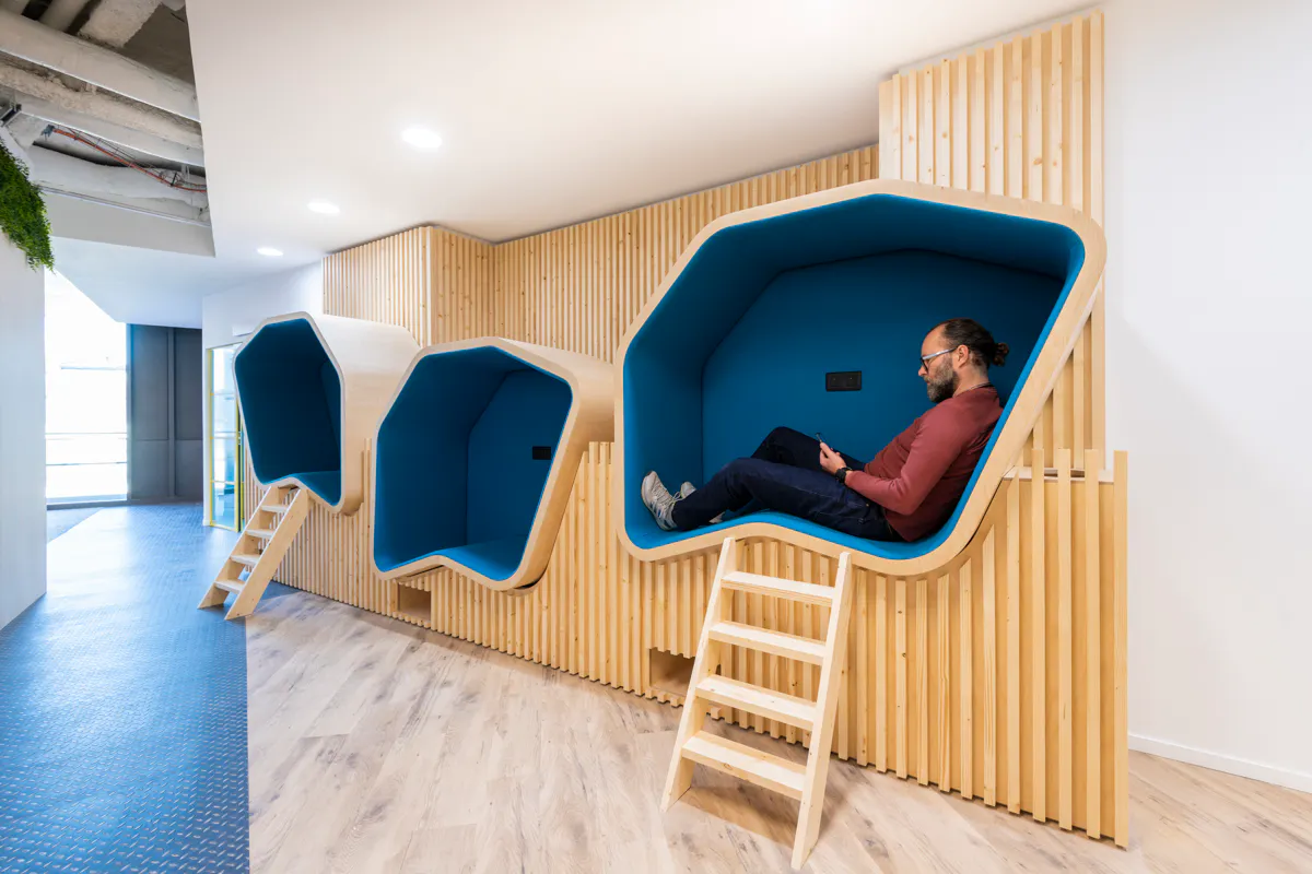
Elevated treehouse-style pods at Criteo’s New York office, alongside the project’s “On-Air” privacy booths. Vertical volume converted into additional focused working capacity without expanding the floorplate. The project was a Mix Awards finalist in the 15,000 to 30,000 sq ft category.
21. Treehouses and Elevated Pods
Four to six metre ceilings are common in heritage buildings and converted industrial space, and almost all of that volume is doing nothing. An elevated pod turns the air above partition height into useable floor area.
A practical use of vertical volume
An elevated pod uses floor space that would otherwise sit underneath as standard circulation or seating, then adds a self-contained meeting or focus space above. The double-use of the footprint is additive: the floor below loses nothing, and the pod above contributes new useable space. Where ceiling height allows, this delivers meaningful additional capacity within an existing footprint without expanding the lease.
They need real engineering, not just visual flourish
The structural, acoustic and access requirements of an elevated pod are non-trivial. Loadings need verifying against the existing slab. Acoustic isolation between the pod and the space below requires careful detailing. Access, typically a small staircase or fixed ladder, needs to comply with current building regulations including means of escape. We coordinate this with structural and fire engineers as standard, and the lead time for a properly engineered elevated pod is longer than for a standard floor-level meeting room.
When they earn their place
Elevated pods work best in characterful spaces where ceiling height is a defining feature, floor area is constrained, and the design intent is to celebrate the volume rather than divide it horizontally with a mezzanine. They are less appropriate in standard commercial floors with 2.7 to 3.0 metre ceilings, where the engineering overhead does not pay back against a standard pod or meeting room.
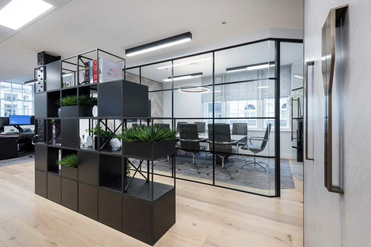
22. Modular and Reconfigurable Furniture
Modular and reconfigurable furniture exists because eighteen months after handover the layout rarely matches how the floor is being used. Teams reorganise, headcount fluctuates, hybrid patterns evolve, and the furniture specified at design stage frequently no longer fits. Modular furniture is the design response to that mismatch.
Specify for movement, not just appearance
Modular furniture is available from all the major manufacturers and is no longer a visual compromise. Bench desking systems that extend or contract by module, soft seating that breaks down into individual armchairs or recombines into team settings, demountable partitions that reconfigure without dust or disruption, and table systems that link and unlink to handle anything from a four-person huddle to a 24-person workshop are all available within standard commercial budgets. See our office furniture service for how we specify and procure these.

Modular collaboration furniture at Criteo’s London office. Sections that link and unlink, supporting team sizes from two to twenty without specifying additional spaces or buying additional furniture.
The sustainability case is part of the brief
Modular and demountable furniture delivers a meaningful sustainability benefit. A bench desk system extended by adding modules has a far lower lifetime environmental impact than a fixed system that has to be ripped out and replaced. The same applies to demountable partitions, which relocate without the demolition and disposal conventional partition reconfiguration generates.

Dentsu’s Edinburgh fit-out at The Stamp Office reused as much existing furniture as possible in line with the client’s ERG guidelines, with some pieces relocated from other Dentsu UK offices. Modular meeting pods provide acoustic privacy and future-proof the layout against reconfiguration.

23. Colour Psychology and Zoning
The default palette of white, grey and one muted brand tone produces offices that are competent and forgettable. Colour is the cheapest tool available for fixing that, and the most underused. A considered use of colour delivers a difference in mood, wayfinding clarity and brand expression without significant cost premium.
Different colours for different functions
The basic principles are well established. Cool tones (blues, greens) support focus and concentration, and work well in deep-work zones and focus rooms. Warm tones (terracottas, ochres, warm reds) support social interaction and collaboration, and work well in breakout zones and meeting spaces. Neutrals handle the bulk of the floor, providing the calm background against which accent colours register. Using these to zone different functional areas gives staff a strong intuitive sense of “this is where I do that kind of work.”

Multi-coloured furniture at Cripplegate Foundation’s Islington office. Eclectic seating defines the breakout area visually and emotionally as a zone for relaxation and informal interaction, distinct from the calmer palette of the workspace.
Brand expression without saturation
Many briefs ask for “the brand colours, throughout.” This rarely produces good results. A sophisticated brand expression uses brand colour as accent within a wider palette of supporting tones, materials and textures. The signal becomes stronger because it is not constant background noise. We typically build a colour strategy that includes the brand palette but is not limited to it, with neutrals carrying the bulk of the surface area.
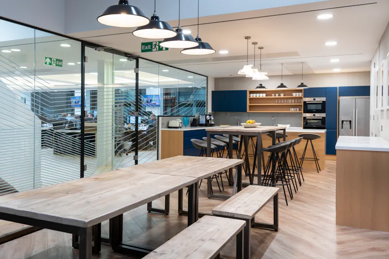
Brand colour used as deliberate accent at Javelin Commodities in St James’s. Neutral background tones carry the bulk of the surfaces, with brand elements registering more strongly because they sit within a calm palette rather than competing with it.
For our full treatment of colour, see our article on colour and office design.

24. Lockers and Personal Storage
Personal storage matters more as the office gets less personal. The pedestal is gone and most offices never replaced it with anything, so people carry their laptop, their charger and their cycle helmet around with them all day. The design now needs to replace that personal anchor with something equivalent.
The locker bank is the new pedestal
A well-specified locker bank does for the hybrid office what the personal pedestal did for the fixed-desk office. The detail matters: digital access rather than key locks, which are constantly lost; a size mix accommodating everything from a laptop to a cycling kit; charging points inside the larger lockers; and a positioning strategy that puts the lockers on the natural route from the entrance to the workspace. At Criteo APAC, the locker bank became a design feature in its own right, fronted with Singaporean stamp graphics that anchor the space to its location.

Personal locker storage at Beartooth Advisors. Digital access, mixed sizes and positioning on the natural route into the workspace replace the personal pedestal as the daily anchor for belongings, devices and personal items.
Bookable storage or allocated storage
The choice between bookable lockers, assigned for the day from a pool, and allocated lockers, permanently assigned per staff member, is one of the more important policy decisions in a hybrid office. Allocated lockers feel more personal but reduce flexibility; bookable lockers maximise utilisation but feel more transactional. We typically recommend a mix, with a smaller pool of bookable day-lockers for visiting staff and a larger pool of allocated lockers for the core team.
Coats, kit and cycling gear
Storage for outerwear, sports kit and cycling gear is a separate question from device and document storage. A bank of smaller lockers near the desks does not solve where to put a wet cycling jacket in November. We typically specify a separate cloakroom or coat storage near the entrance, integrated with the end-of-trip facilities covered in idea 29.

25. Art in the Workplace
A considered art programme is one of the most underused tools available. Most offices buy framed prints at fit-out stage and never touch them again, where a small additional investment in a curated collection, a rotating loan programme or a partnership with a local gallery delivers a measurable difference in how the space is experienced day to day.
The wellbeing case is well established
Art provides visual rest in environments otherwise heavily focused on screens, signals that the organisation has invested thought in the staff environment, and creates the conversation triggers that build relationships between colleagues. None of these benefits show up in the standard framed-print fit-out.
Partnerships beat one-off purchases
The most effective art strategies we have implemented involve ongoing relationships instead of one-off purchases. A loan programme with a gallery rotates the collection every six months, keeping the space fresh and supporting emerging artists. A staff art committee with a small annual budget builds engagement and avoids the “corporate art” problem. A partnership with a charity or arts organisation aligns the programme with the organisation’s values rather than just decorating the walls. At Cantillon Capital Management, the collection includes works by Antony Gormley, integrated into the design rather than hung as an afterthought.

Sculptural and curated artwork at Netflix Madrid. Considered visual moments that reward attention and break the screen-heavy default of a media organisation’s working environment.
Bespoke commissions for specific spaces
For the most important moments in the floorplan – reception, the principal boardroom, the main circulation axis – a commission often delivers more value than a more expensive purchased piece. A commission engages the artist with the space, scales correctly to the architecture, and produces a unique reference point nothing off-the-shelf can match.
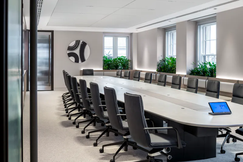
Commissioned artwork in the boardroom at a Mayfair private investment firm. Scaled and composed specifically for the space, providing a defined visual anchor for the most consequential meetings in the office.

26. Wayfinding, Movement and Walking Routes
Two questions run in parallel on any floor: where is everything, and what is the walk between those places like. Most plans answer the first and leave the second to whatever space is left over.
Wayfinding is harder than it looks
In multi-floor buildings, in offices serving regular external visitors, or in spaces with a mixed permanent and hot-desking population, the daily friction of “where is the meeting room, where is the loo, how do I get back to reception” adds up to a meaningful drag on the experience of being there.
Good wayfinding has not changed conceptually for decades: visitors should orient themselves within seconds of arriving, find the room they need without asking, and return to where they started without retracing their steps. What has changed is the execution: digital screens at lift lobbies showing real-time room availability and directions, colour-coded zones that give an instinctive sense of location, material transitions that signal a change of zone, and integrated signage that respects the design language of the wider space. At Criteo APAC the zoning was made explicit in the naming – Customer Suite, The Common, Town Centre – so the vocabulary itself does part of the wayfinding work.

Wayfinding at ESCA’s 20,000 sq ft office across three levels of a Grade II listed Georgian building at St Katharine Docks. Clear graphic identity, considered placement, and integration with the wider design language instead of off-the-shelf signage bolted on.
Floor materials are part of the wayfinding
A change in floor material is one of the strongest navigational signals available. Carpeted work zones, tiled or polished concrete circulation routes, and timber-floored social spaces give visitors an intuitive understanding of where they are without ever reading a sign. We use this consistently across our larger projects, and the cumulative effect on visitor experience is significant.

Material transitions at Criteo’s New York office signal zone changes intuitively. Floor surface, ceiling treatment and lighting all shift together as you move from reception into circulation and then into the working zones.
Design the walk, not just the stops
The best floor plans treat circulation as an active design tool rather than leftover space between programmes. A floor designed to encourage movement has its kitchen, breakout zones and amenity spaces positioned far enough from the desks that staff naturally walk to reach them. The route passes other teams, the collaborative zones and the views, so the walk itself becomes a social and visual experience instead of a march down a corridor.

Circulation at the Global Innovation Institute designed as active workspace not passive corridor. Generous proportions, daylight, planting and incidental seating make the walk between zones part of the experience.
Movement and posture reinforce each other
The same logic that makes sit-stand desks valuable reinforces the case for movement-friendly floor plans. A floor where the natural way to use it involves walking 50 to 200 metres several times a day, plus changing posture at the desk, plus standing for short meetings, accumulates a meaningful improvement in physical activity compared with staying in one chair for eight hours.
27. Bistro-Style Reception Areas
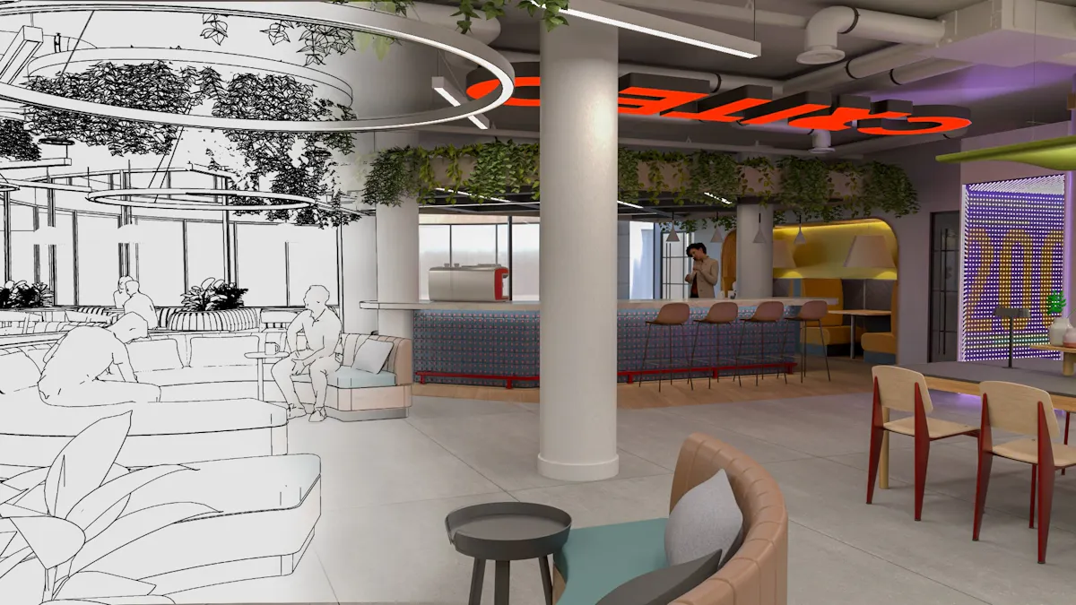
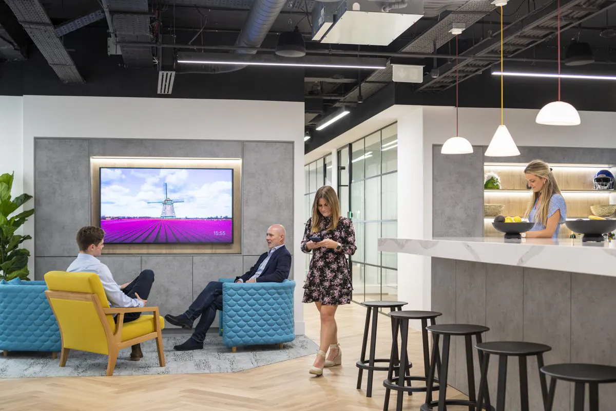
The reception desk handles fewer jobs every year – no signing-in book, no parcels, few phone calls – and it still occupies the best position on the floor. Replacing it with a welcoming counter, comfortable seating, planting and decent coffee sends a “welcome, take a seat” signal rather than “please wait to be processed.”
A different first signal
For client-facing organisations where the first impression matters, that signal is worth meaningful design investment. The format works partly because it is more hospitable, and partly because the conventional reception desk now looks under-occupied for most of the day.

DTRE’s BREEAM Very Good Mayfair office uses a bistro-style reception. A barista coffee bar, comfortable seating and planting replace the conventional reception desk, creating a welcoming arrival environment that doubles as informal meeting space.
It needs to be properly resourced
A bistro reception fails if the coffee is bad or the seating is uncomfortable. The format only works if the operational detail is right: a proper espresso machine, decent cups, fresh milk on hand, comfortable chairs suited to a 30-minute wait, and someone within easy reach to handle visitor questions. The visual design is the easy part. The operational layer determines whether it feels welcoming day to day.
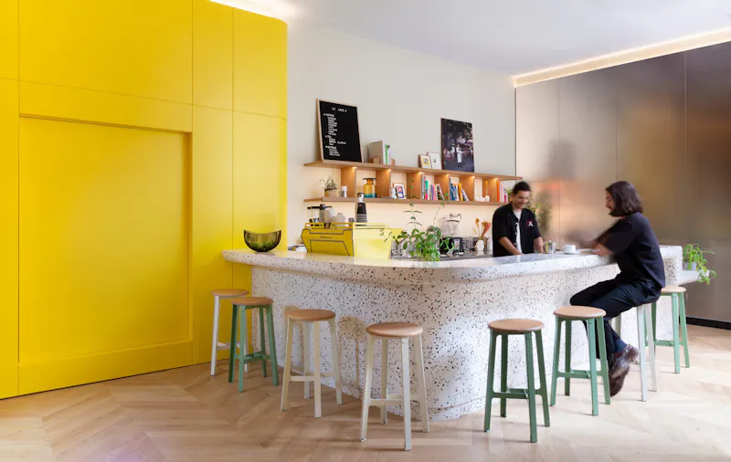
A barista bar at Snap Inc.’s 102,000 sq ft Paris HQ. The hosting experience starts with a proper coffee in a properly designed space, not a transaction at a reception desk.

28. Social Kitchens and Tea Points
The kitchen and tea point is the most underspecified space in most offices. Brief it like a kitchen and it becomes the social heart of the floor. Brief it like a cupboard with a kettle in it, and people make a coffee and leave.
Specify it like a kitchen, not like an office feature
The brief for an office kitchen should look more like a residential kitchen brief than an office one. Good storage, decent appliances – a proper coffee machine, a quality dishwasher, a fridge with enough capacity – generous worktop space, and seating that supports both quick coffee breaks and longer informal meetings. The aim is a space that handles 30 to 50 people through the day without ever feeling overrun.

The social kitchen at Criteo’s London office, specified as a genuine social nexus instead of a functional break-out space. Generous proportions, quality finishes and proper kitchen specification supporting use throughout the working day.
The seating mix matters
A single seating type does not work for a kitchen. The combination that works best is a high counter or bar for quick stand-up coffees, a mix of café-style tables for 15 to 30 minute informal meetings, and a long communal table for shared lunches and larger gatherings. That flexibility supports the mixed use kitchens see through a working day.
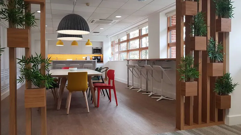
Santen Pharmaceutical’s office kitchen. Mixed seating from bar counter to communal table, properly specified appliances, and finish quality that justifies the space functioning as a daily social hub.
Pantry capacity for shared events
For organisations hosting regular all-hands or social events, kitchen capacity beyond daily use becomes important. A small back-of-house prep area, additional fridge capacity, and storage for glassware and serving equipment lets the same kitchen scale up to a 100-person event without disrupting normal daily operations. At Snap Inc.’s Paris headquarters that logic extended to a 70-seat auditorium and a rooftop greenhouse; at Instinctif Partners, to a 70-seat town hall space. We design this capacity into kitchen specifications wherever the brief calls for regular hosting.

29. End-of-Trip Facilities and Active Commute Support
A token shower in a far corner, with nowhere to change and nowhere to dry a kit bag, does not enable anyone to cycle in. End-of-trip facilities have moved from premium new-build amenity to baseline expectation in any fit out over 5,000 sq ft, driven by hybrid working, rising cycle commute rates in London and the broader wellbeing case for active travel.
Specify for genuine use, not aspiration
What enables cycle commuting is properly resourced infrastructure: secure long-stay bike storage close to the entrance, drying space for wet kit, showers with decent water pressure and reliable hot water, lockers sized for cycle gear, and changing rooms with the privacy and quality staff would expect at a gym. At DTRE’s 11,000 sq ft Mayfair office the provision runs to BREEAM-grade end-of-trip facilities alongside a gym and Peloton studio, positioned for genuine daily use rather than treated as a compliance tick-box.
The downstream effect on the working day
Where end-of-trip facilities are properly resourced, the proportion of staff who cycle, run or walk to work increases meaningfully. The downstream effects – cardiovascular health, mental wellbeing, reduced car and public transport reliance, lower carbon footprint – are well documented. For organisations in BREEAM-rated buildings, the credits associated with active travel provision also contribute to the sustainability rating.
Wellbeing benefits show up in retention
The clearest commercial benefit of wellbeing-led design shows up in how people feel about the organisation, not just in productivity. Leesman’s 2026 wellbeing analysis, covering 196,694 employees, found only 52% say their workplace helps maintain the energy levels needed to do their job and just 53% have places to mentally refresh – which is a large gap and a large opportunity. For senior hires in financial services, legal and professional services, where replacement costs run into six figures, closing that gap justifies a wellbeing-led design brief on its own. See our article on designing for workplace wellbeing.
30. AI-Ready Workspaces and Voice Tool Support
A floor that was comfortable when work was silent and screen-based gets noticeably louder once a decent share of the team is talking to their tools. Dictation, live prompting and reading responses out loud put a sound load on open plan that nothing was built to absorb. Designing for this is less about new technology on the desk and more about giving people somewhere to use it without disrupting the people around them.
Voice work needs somewhere to happen
The practical consequence of voice-driven AI is a sharp rise in demand for acoustic privacy. The fix is not new hardware. It is more single-person booths than the old ratios assumed, positioned for walk-up access. We typically increase the ratio of single-person booths to desks on floors where voice AI use is already established. Given the Kim and de Dear finding that sound privacy is already the largest source of workplace dissatisfaction, adding voice load to an untreated floor compounds a problem that was there before.
Build the AV and connectivity to support it
AI meeting tools that transcribe, summarise and action calls in real time are now standard in many of our clients’ environments. They need accommodating in the AV specification from the outset instead of retrofitted: reliable microphone coverage in meeting rooms, clean network capacity, and the same one-touch simplicity that makes any meeting room get used. The detail that matters is reliability. A transcription tool that drops the back half of the room undermines confidence in the whole setup.

31. Outdoor Workspaces and Terraces
If the lease comes with a terrace, balcony or courtyard, the question is whether you design it as floor area or leave it as a view. Designing it as usable workspace adds capacity and supports the wellbeing case for fresh air and daylight covered earlier in this guide.
Make it usable, not decorative
A terrace only earns its place if people can work and meet on it. That means weather-resilient furniture rated for outdoor use, shade and shelter so the space works across more of the year, power and reliable Wi-Fi so a laptop session outside is viable, and a layout supporting both informal catch-ups and quiet individual work. A terrace with a couple of benches and no power is a view, not a workspace. At Cube Real Estate in Guildford and Bericote’s London mews building, the roof terrace was treated as part of the usable floor area from the outset rather than an amenity bolted on at the end.
The connection back inside matters
The best outdoor spaces are designed in continuity with the interior, not as a separate zone reached through a fire door. Level thresholds, a consistent material language across the boundary, and a clear sightline from the social hub or breakout space encourage daily use. When the terrace reads as part of the same room, people use it as part of the same working day.
Bringing Your Office Design Ideas to Life
These 31 ideas are not a checklist to apply in full. The right combination depends on your sector, your space, your budget and the way your teams work. The thread running through all of them is the same: a workplace that people want to come into, that supports the work instead of getting in its way, and that holds up once it is in daily use instead of just looking good on handover day.
K2 Space was founded in 2004 by two furniture specialists, and that heritage still shapes how we approach pods, acoustic solutions and furniture specification. We have completed more than 25,000 workspace installations, work directly with manufacturers including Framery, Spacestor and Senator as a MillerKnoll authorised dealer, and have delivered office design, fit out, refurbishment and furniture projects for clients including PJT Partners, Rolls-Royce, Netflix, Snap Inc., Dentsu and Criteo across London and internationally. You can see the full range in our case studies.
If you are working through a brief and want to talk any of this through, take a look at our office design services in London or get in touch. We are happy to give a straight view on what will and will not work for your space, before any design work begins.
Office Design FAQs
Do you deal with offices this small?
Yes. We have designed and built offices from around 700 sq ft up to 102,000 sq ft, and the questions are the same at both ends: how many desks fit, what will it cost, how long will it take. There is no minimum project size. Our 2,496 sq ft project for a London investment firm, in a 1930s former bank, was a Mix Awards 2025 finalist in the sub-5,000 sq ft category.
How much does an office fit out cost?
Our office fit-out cost guide gives a working benchmark for London, with what each band includes. Furniture is a separate line within it and varies with specification. Full breakdown in our office fit out costs guide.
Can we reuse our existing furniture?
Often, yes, and it is worth asking early. Desks and storage in good condition frequently carry over, and reupholstery extends the life of soft seating and task chairs considerably. We audit what you have at the start and tell you what is worth keeping, what is worth refurbishing and what has reached the end. Across our projects we have reused more than 1,000 items of existing furniture. It reduces cost and embodied carbon at the same time.
How much space do we need?
The British Council for Offices recommends 10 sq m – about 108 sq ft – per person for general workspace, with 8 sq m reserved for exceptional high-density cases. In practice, post-pandemic utilisation runs lower: the BCO’s 2025 review puts effective density at 15 sq m per occupant, up from 12.5 sq m. Where you land depends on how many enclosed rooms you need and how much of the team is in on a given day. Before taking more floor area, get the existing space planned. See our guide to space planning.
What is the difference between a focus pod and a phone booth?
A phone booth is a single-person acoustic enclosure for quick private calls, needing strong sound isolation, reliable ventilation and lighting good enough for camera work. A focus or meeting pod is larger, usually four to six people, and adds video conferencing, a screen and seating that supports a 30 to 60 minute session. Matching the type to the actual use is the specification decision that matters most.
How much does an office pod cost?
Excluding VAT, a one-person phone booth runs £3,000 to £17,000, a two-person pod £7,500 to £20,000, a four-person pod £12,000 to £26,000, and a six-person pod £22,000 to £35,000. The spread comes down to glazing, acoustic rating, ventilation and AV. Full detail in our office pod cost guide.
How important are acoustics in an open plan office?
Very. An analysis of 42,764 office occupant surveys found sound privacy is the single largest source of workplace dissatisfaction, affecting 58 to 59% of people in open-plan cubicles against 18% in private offices. Good acoustic design is not about making the whole floor silent. It manages sound across distinct zones – a natural hum near the social hub, speech clarity in meeting rooms, near-silence in focus areas – using room isolation, reverberation control and sound masking together.
How long does an office fit out take?
A design and build project typically runs 8 to 12 weeks on site, around 30 to 40% faster than traditional procurement, where design and construction are tendered separately and the programme runs 15 to 40 weeks. Add time before that for briefing, space planning and landlord approvals. See how long an office fit out takes and design and build vs traditional procurement.
What do you need from us to give us a price?
Four things give an indicative number: the square footage, the number of people, roughly when you need to be in, and whether the space is a shell, a landlord’s Cat A handover or an existing office you are staying in. A floor plan helps but is not essential. If you do not know all four, tell us what you do know and we will work from there.